


BIPA
BIPA is a health and beauty retail chain in Croatia, part of REWE Group. Its website has one commercial job: move a shopper from a phone into a store. People arrive looking for the current leaflet, a seasonal campaign, a loyalty benefit or the nearest store, usually on a phone and usually minutes before deciding where to shop. The site is the last thing they check before they go.
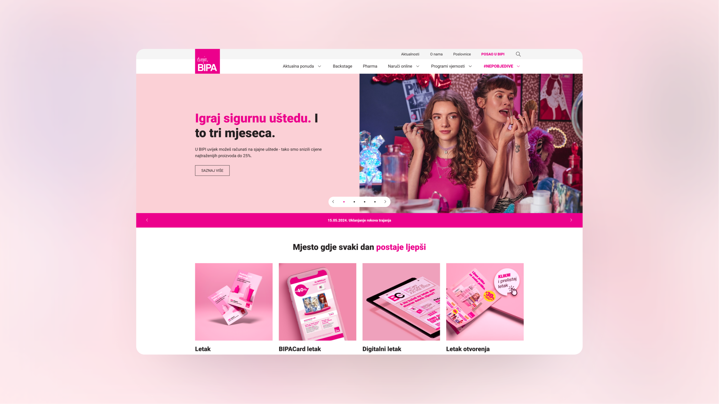
We rebuilt bipa.hr as the digital shop window for that store network: new information architecture with the weekly leaflet in primary navigation, a reusable design system that holds a heavy campaign calendar without crowding the page, and a WordPress theme that lets BIPA’s marketing team publish every week without a developer.

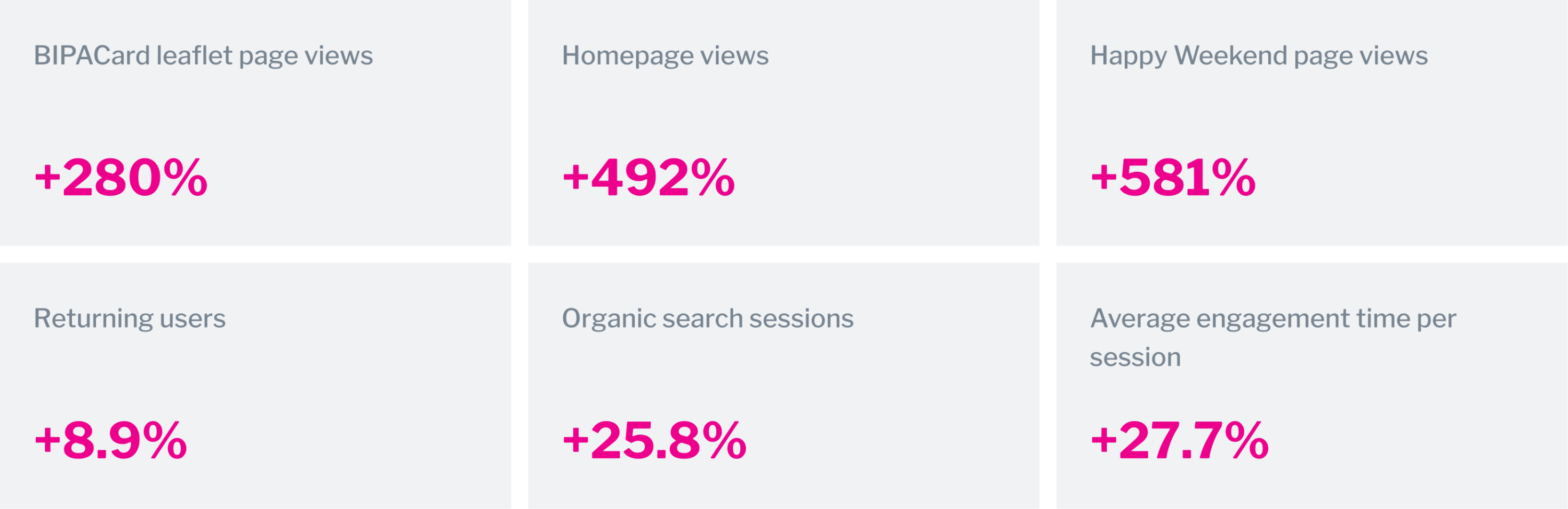
+492% homepage views

63,826 leaflet CTA clicks

+27.7% engagement time per session
The existing problem
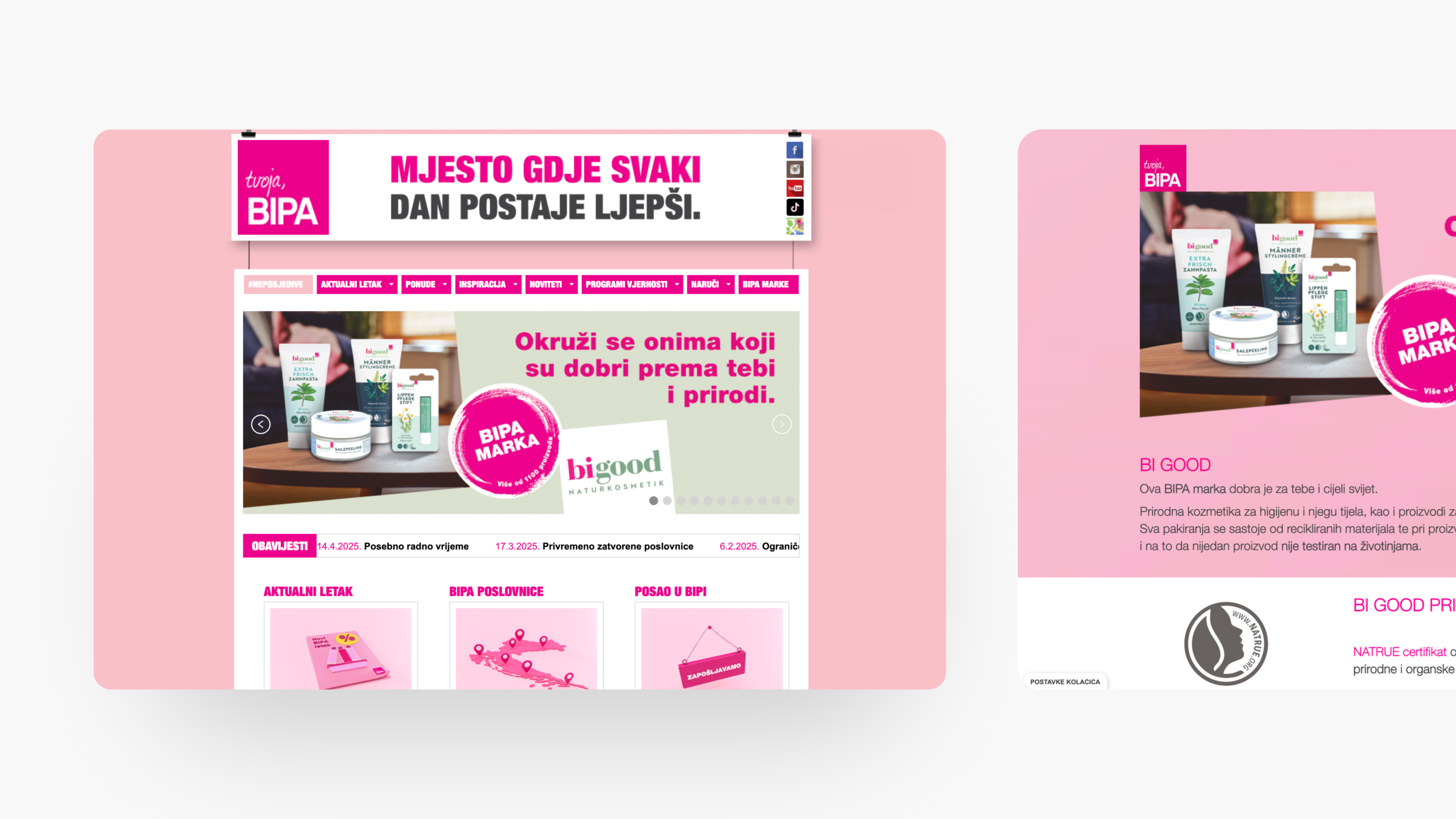
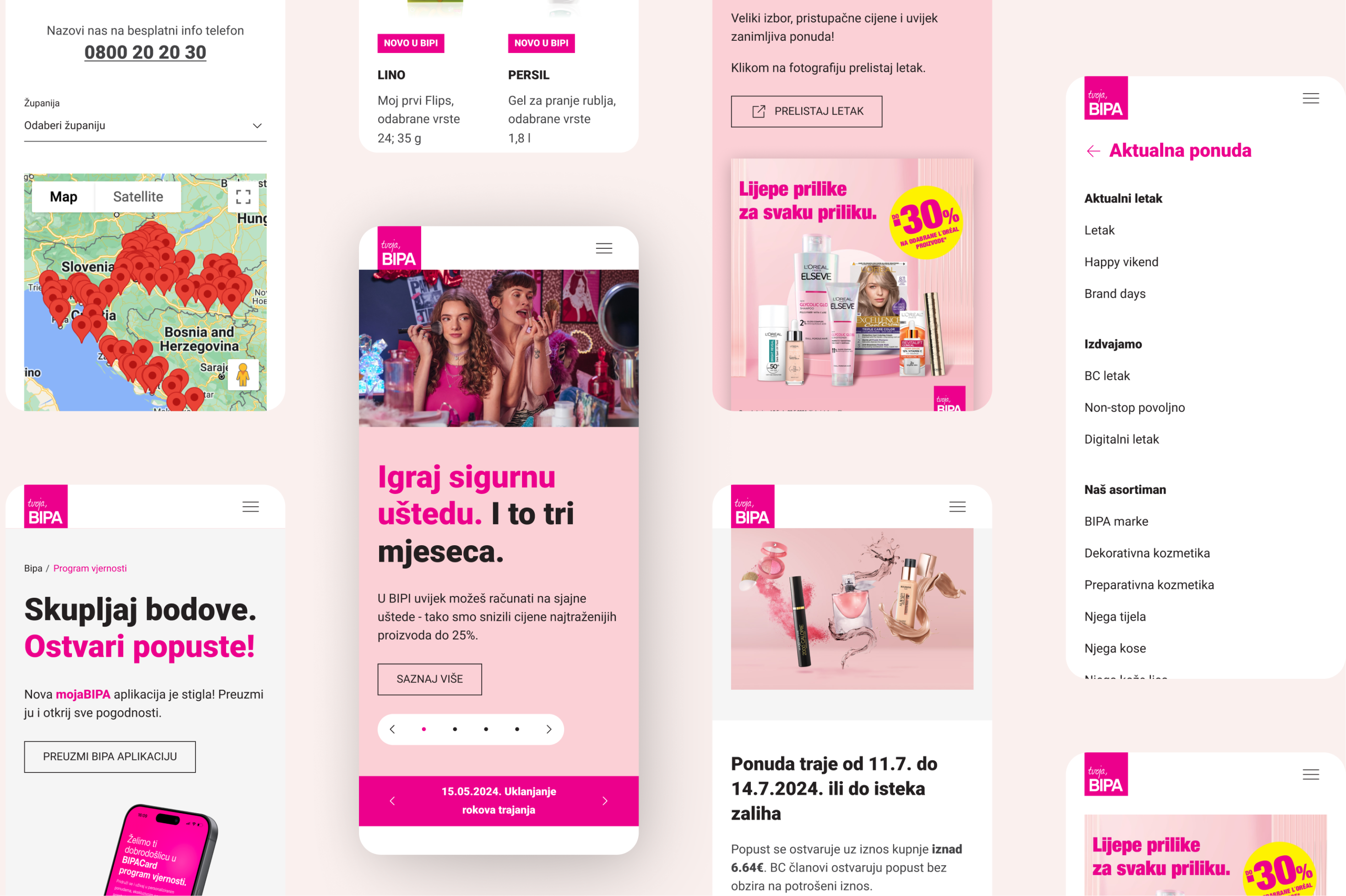
People came for current offers, leaflets, categories, loyalty programs and store information. Those journeys were all present but hard to find, especially on mobile. Content had grown around campaigns, offers, notices and loyalty programs over several years, and the order of the pages no longer reflected how anyone actually looked for information.
BIPA also needed a consistent design language: reusable components, predictable spacing, and page patterns that could survive weekly updates.
Offer discovery section
A shopper checking promotions needs a fast path to the current offer, not an elaborate search through the site. When offers are hard to find on mobile, the website stops doing its most valuable job at the exact moment someone is deciding where to shop. The scale of that gap showed up after launch: BIPACard leaflet page views rose 280%.
Organizational context
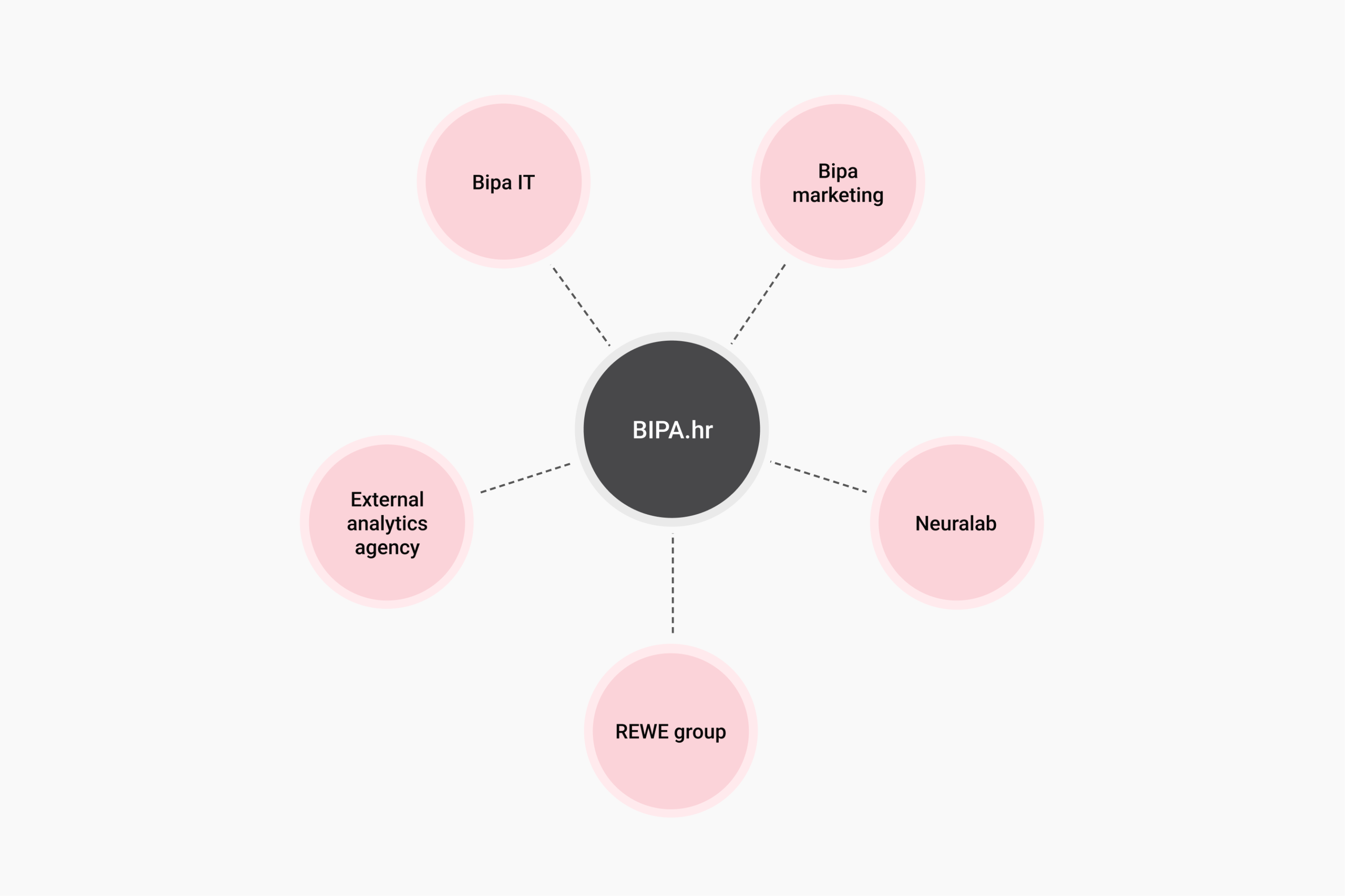
During the build on bipa.hr, all decisions needed documentation and formal approval as well as reviews across several teams, which shaped delivery more than any technical constraint. The project needed clear communication, structured handovers, and choices that would hold up under real operating conditions after the launch.
A presentational website built around retail intent
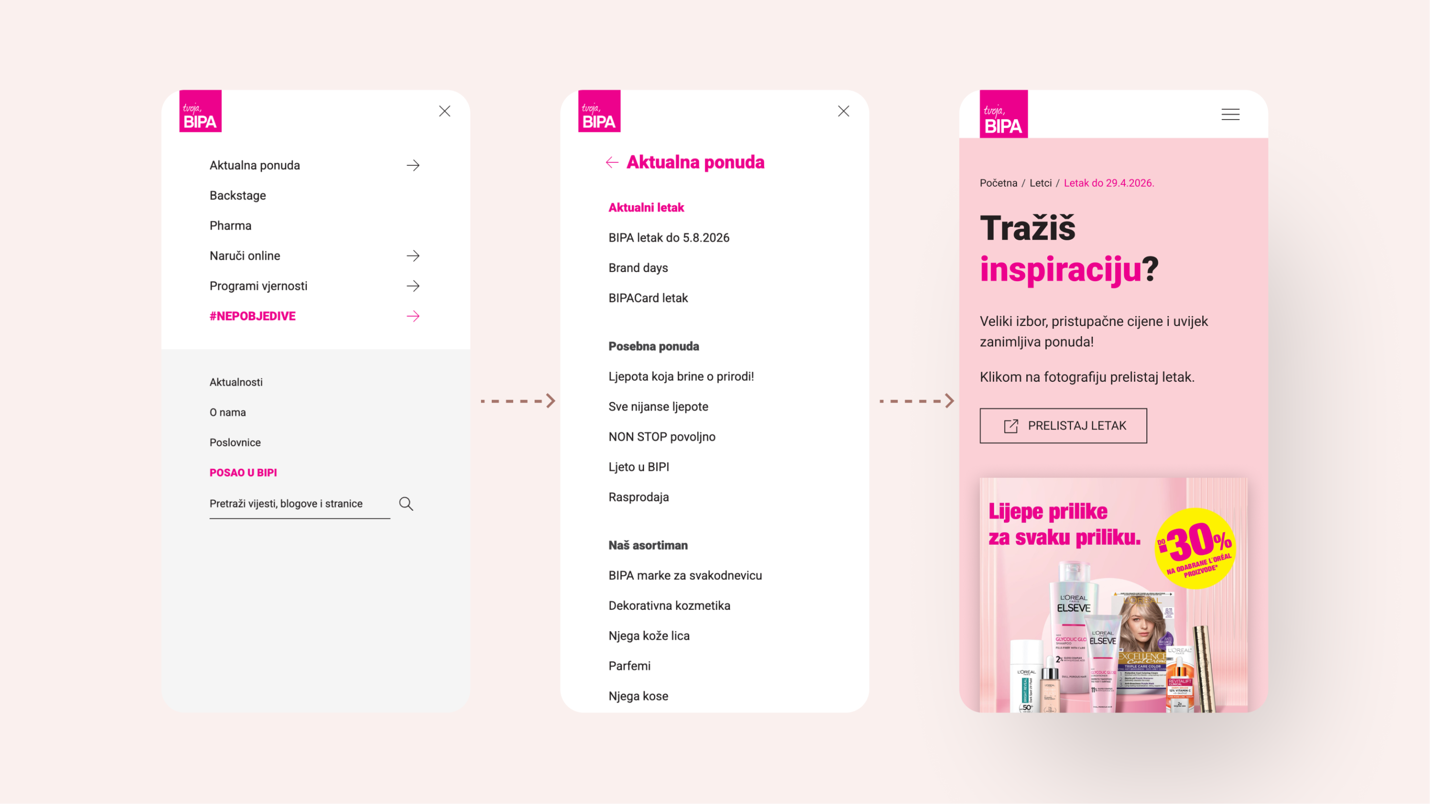
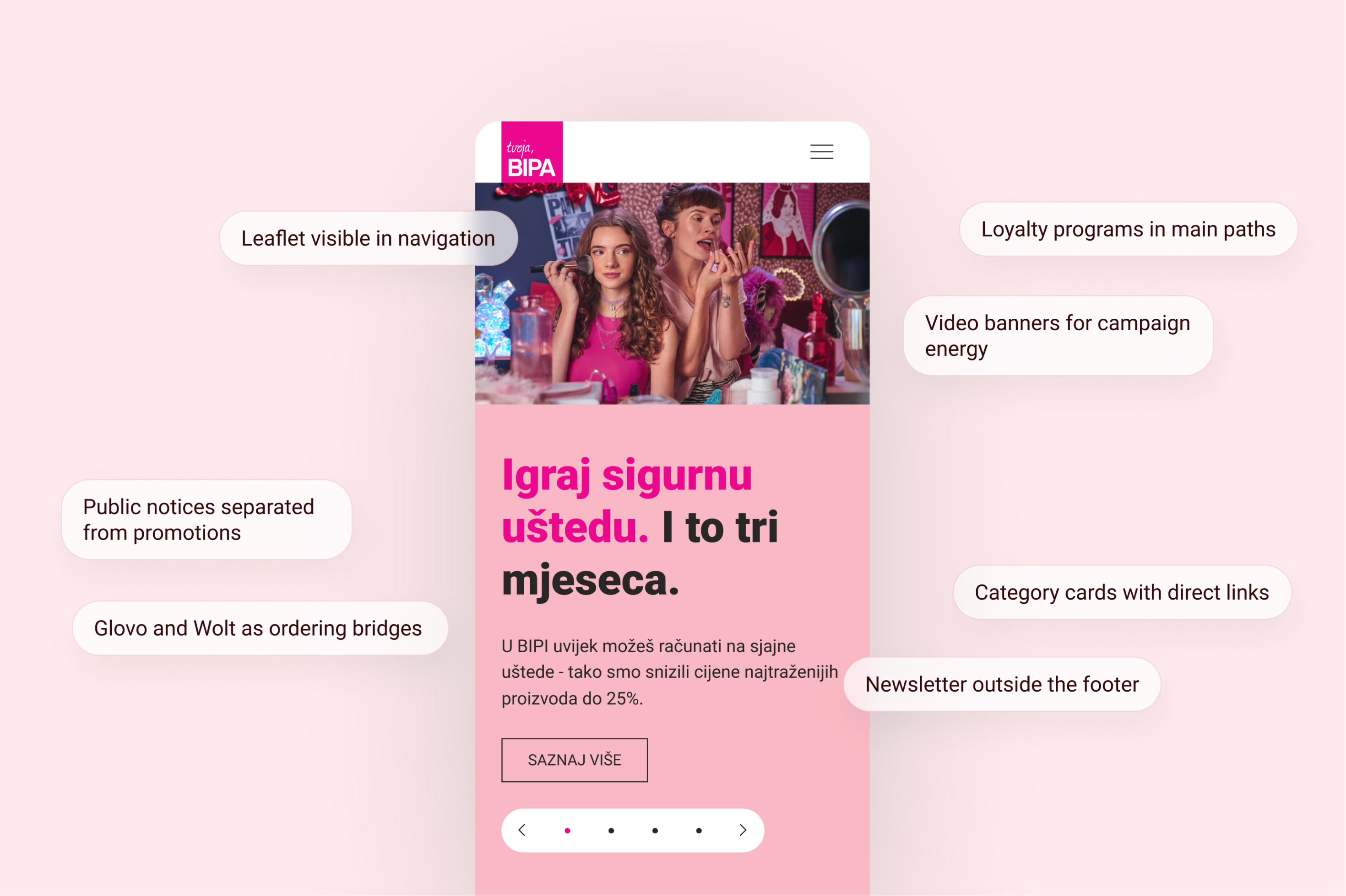
The new website was planned around what users were most likely to do before visiting a brick and mortar store. Structure gives priority to current offers, digital leaflets, loyalty programs, product categories and store information.
Four architecture points:
- Weekly leaflet as a primary navigation item
- Mega menu grouped by user intent rather than by content type
- A separate page and visual treatment per promotion type
- Glovo and Wolt given dedicated ordering paths
Three decisions that shaped the build
WordPress for editorial ownership
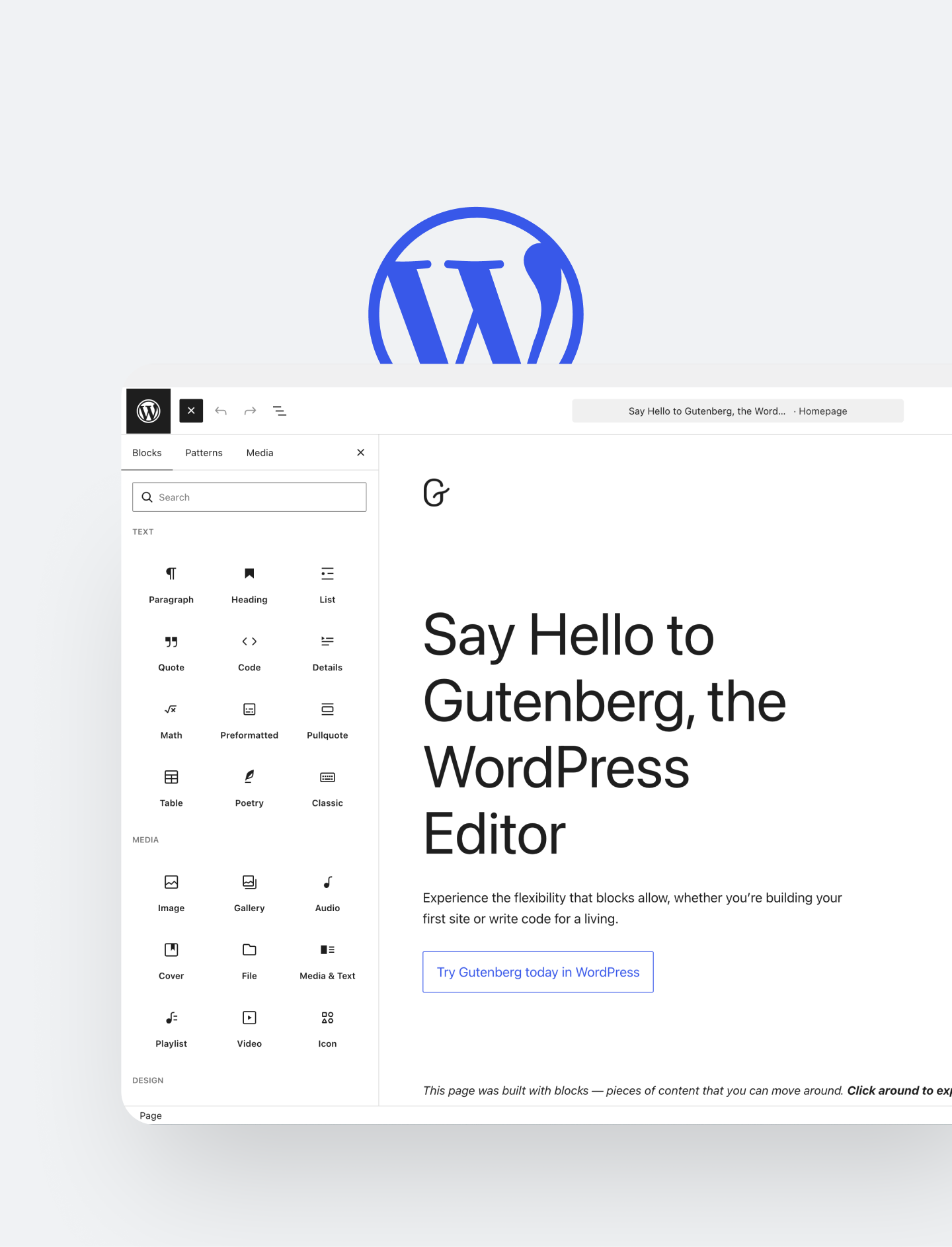
BIPA publishes every week. A custom WordPress theme puts campaigns, banners, notices and page content in the marketing team’s hands, with no tickets to developers.
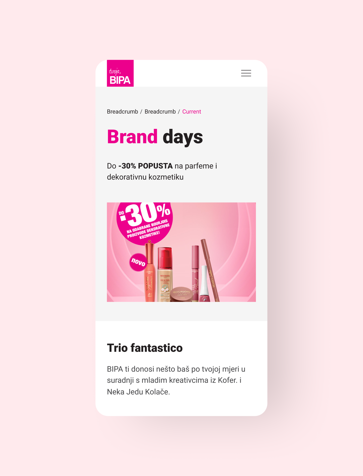
Mobile-first structure
Offer browsing, store lookup, and loyalty information mostly happens on a phone. Mobile was treated as the main retail surface.
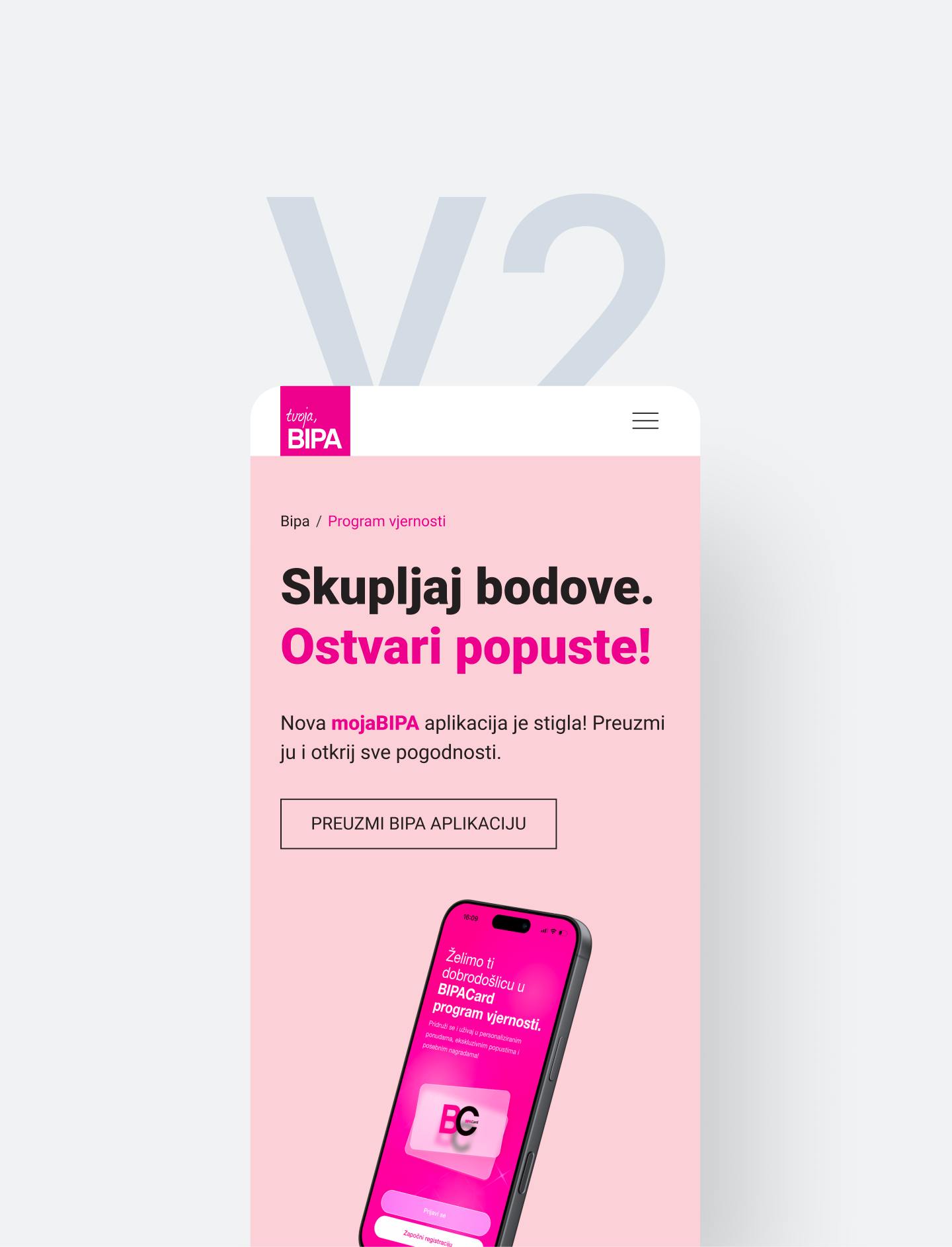
Phased delivery
Some features were moved into maintenance instead of being pushed into the first release. This kept launch focused and gave the team room to improve based on real use.
Design approach
The design system holds a heavy campaign calendar without clogging the page, using a distinct visual treatment per promotion type so a user recognizes what kind of offer they’re looking at and goes straight to the relevant page. Navigation carries more of the business logic than before. The mega menu groups content by intent, and loyalty programs and categories surface early.
The site is live, maintained, and still growing
BIPA’s marketing team has full operational autonomy. They handle daily updates, promos, and banners without relying on a developer for routine maintenance. Neuralab remains an active long-term partner, continually shipping post-launch enhancements while the platform’s flexible design system effortlessly absorbs new campaign demands