Carnet
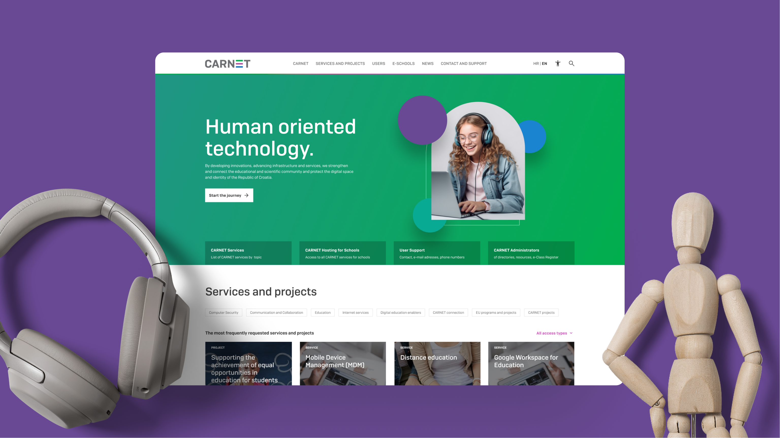
CARNET, the Croatian Academic and Research Network, is a pivotal entity in Croatia, dedicated to fostering the development of information and communication technologies. We orchestrated their new digital hub to align not only with the fresh brand identity but also to resonate with contemporary digital trends, ensuring simplified access to the extensive suite of over 70 services CARNET has to offer.

Melange of 50 content creators

Over 100K monthly visitors
Dedicated dyslexia-friendly component
The challenge
Every month, around 100.000 unique users visit CARNET’s website.
The primary objective was to grant their users with a fresh appearance and structure, novel features, and straightforward navigation to effortlessly access extensive information about their services with minimal clicks.
CARNET’s web was one of the largest and most demanding projects we’ve been working on. Namely, the amount of content is impressive, and the number of collaborators, editors and administrators working on the project from client’s side was by far the largest we’ve encountered thus far.
Communication and collaboration are the biggest challenges in large projects such as this one as they requires aligning opinions and impressions through many (at first) unknown layers.
Accordion elements
With this method, we’ve streamlined the publishing process for CARNET while also simplifying navigation and content consumption for users. The accordion can house downloadable documents, project cards, blog post cards, newsletters, images, videos, and more. Everything is customizable and can be tailored to meet specific client requirements.

A11Y – accessibility
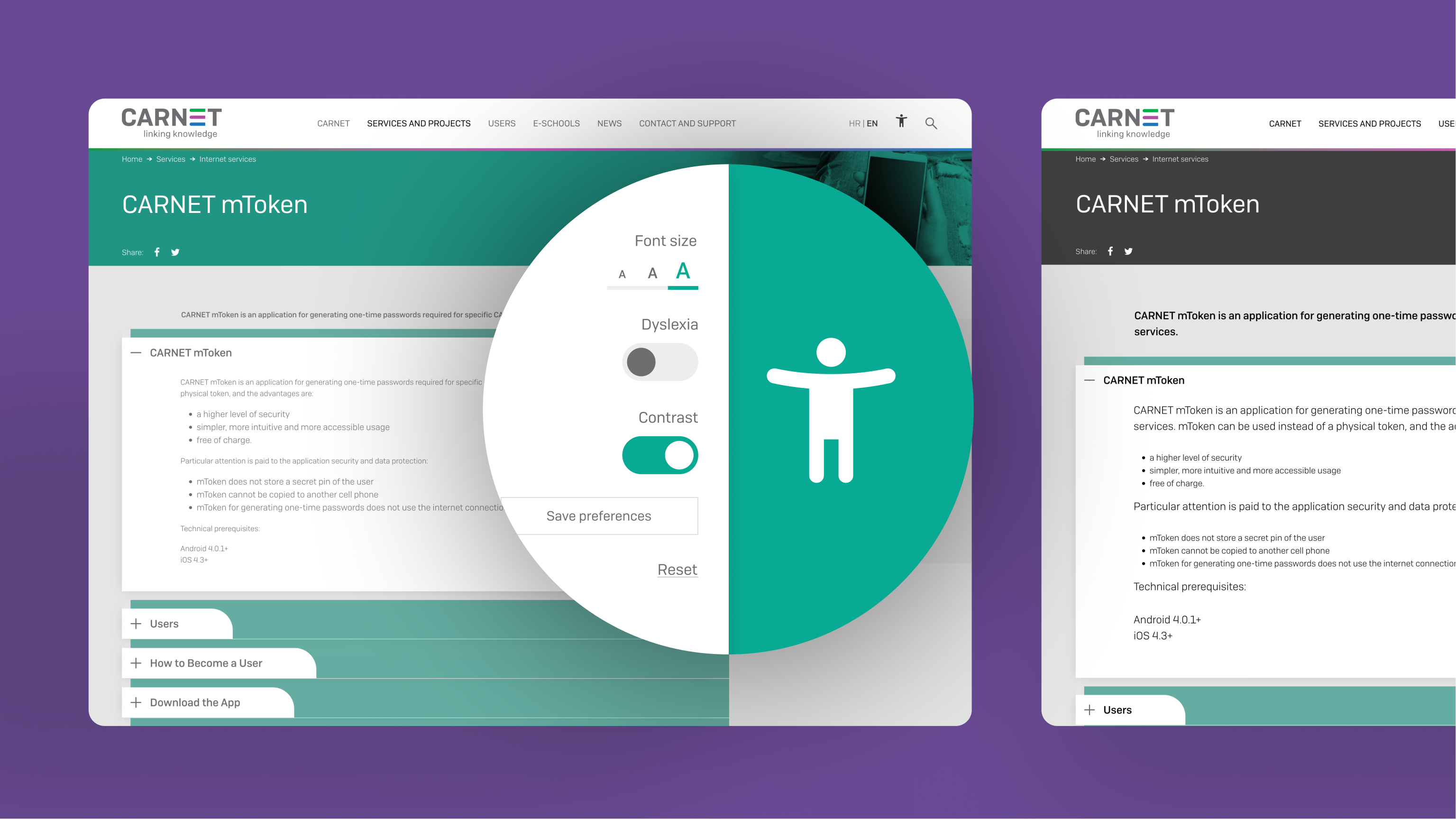
Throughout the website development phase, accessibility emerged as a crucial component. CARNET continuously ensures accessibility for all users, with a special emphasis on easier access to public services and information for individuals with disabilities. We embedded features like dyslexia-friendly letter rendering, “high contrast mode” for the visually impaired, and adjustable font size.
Content is a large part of accessibility, so our WordPress education focused particularly on image optimization, ALT tags, and ensuring that the text is semantically structured with correct headings to facilitate screen reader functionality.
Design approach
Armed with a design trifecta – web design, UI/UX, and interaction design; we wielded Photoshop, Illustrator, Figma, and WordPress to carve out a user-centric haven.
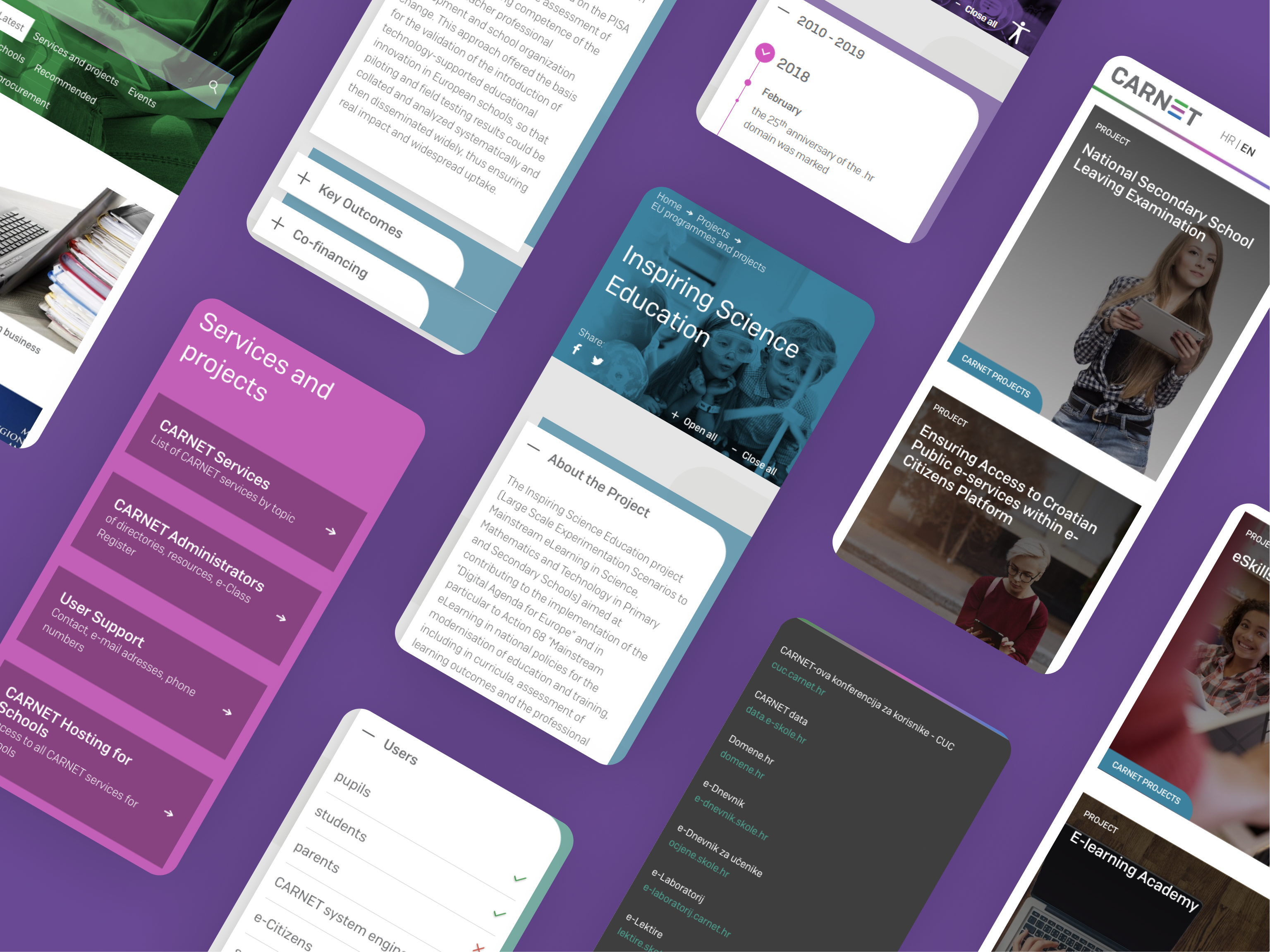
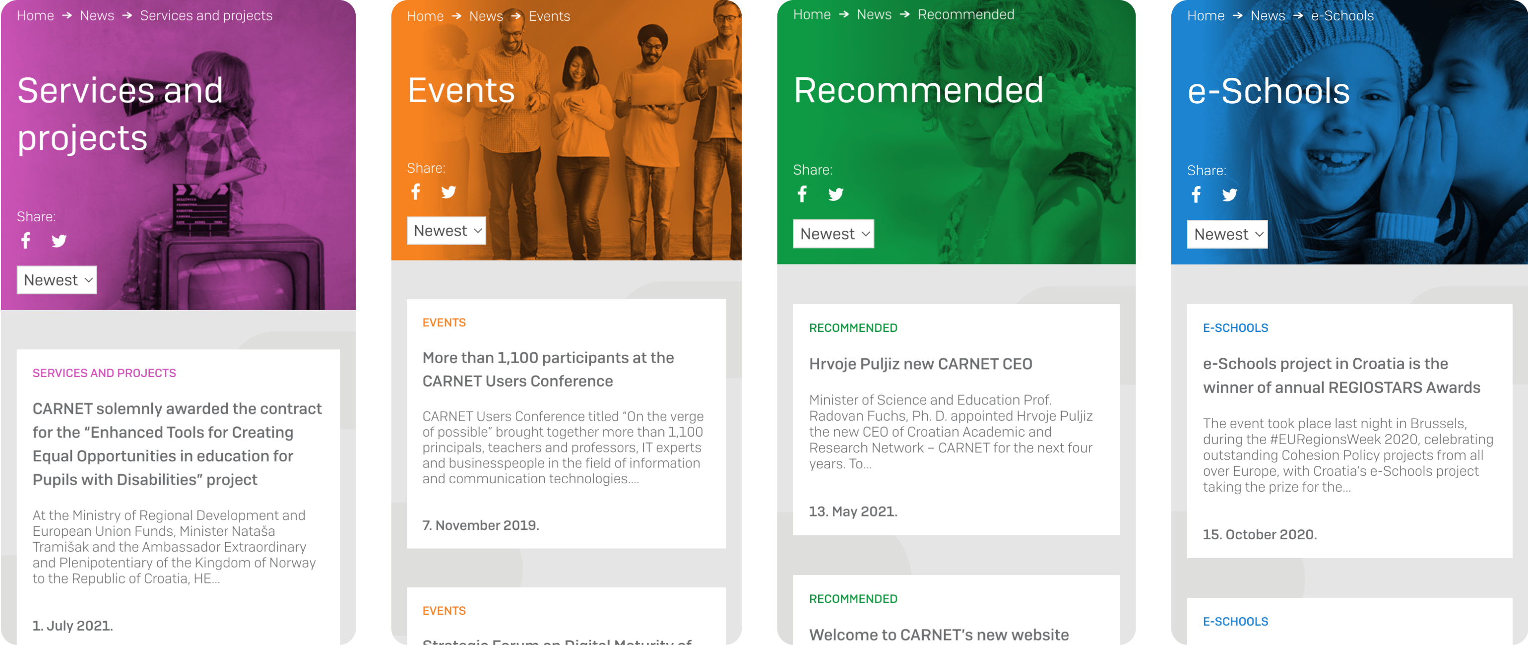
The design work also extended to implementing color coding for enhanced user navigation, crafting intuitive buttons for seamless interactions, and ensuring responsiveness across various devices.
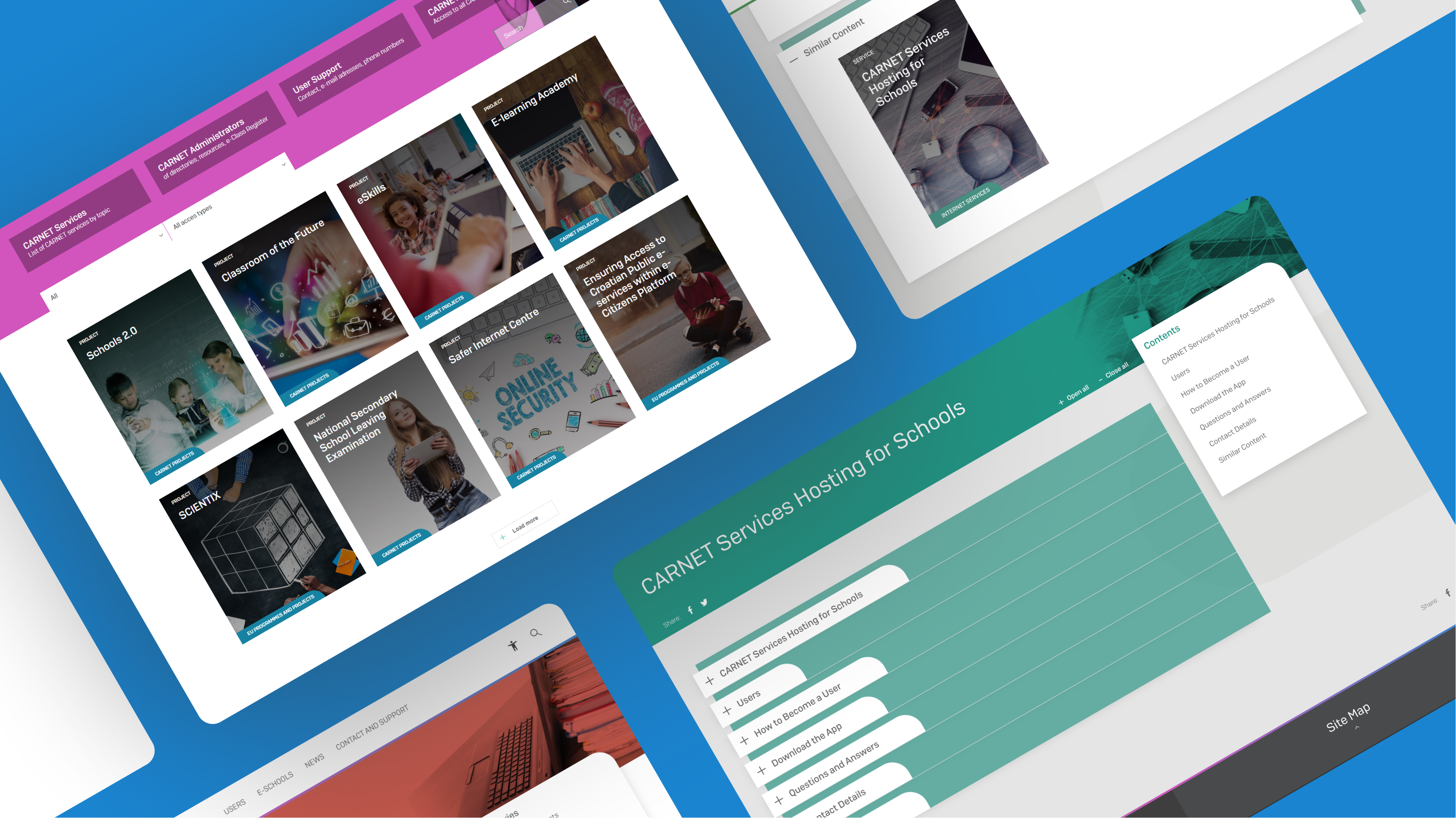
The color scheme facilitated easy identification and categorization of services, while the responsive design ensured a consistent user experience irrespective of the device used.
Nino Ćosić
Marketing Director, Carnet
“Neuralab was a good coach in terms of what to expect, what to do, and how to deliver information to them.”
Read full review on Clutch
