


7 Killer eCommerce Conversion Rate Optimization Tips
Big traffic is coming to your website, but you are struggling with sales? This article will show you 7 ways to increase your eCommerce conversion rate.
If you run an online business, you probably think a lot about your eCommerce conversion rate. In fact, you probably found this article looking for a ways to boost your website sales. If that’s the case, then welcome! Here, we are going to show you some of the best ways to increase it.
So let’s get started…
1. Make your call to action visible
When we talk about call to actions in eCommerce, our thoughts are mainly set on buttons. Their look, color, shape and their text.
For better conversions, try to use colors that are in contrast from the overall website background. Try not to use gray colors for buttons because they might trick visitors into thinking they are not clickable which could lead to lower clicks and lost conversions. Instead, try to use colors that stands out like red, blue, green or orange depending on your website color theme. Use a different hover color so users can get a feel they are interacting with a clickable button. Also, don’t overwhelm your visitors with too much call to actions. Use them reasonably depending on your page scroll length.

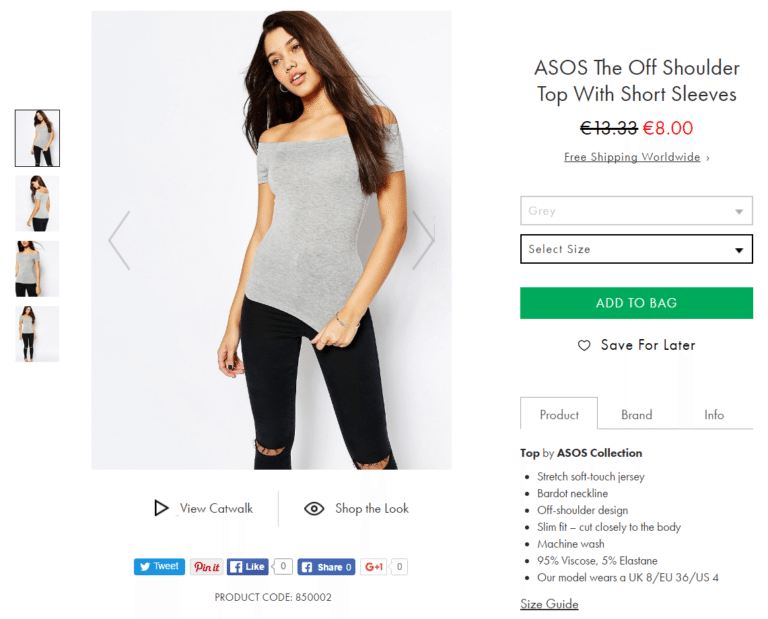
Can you find how many call to actions are in this product page?
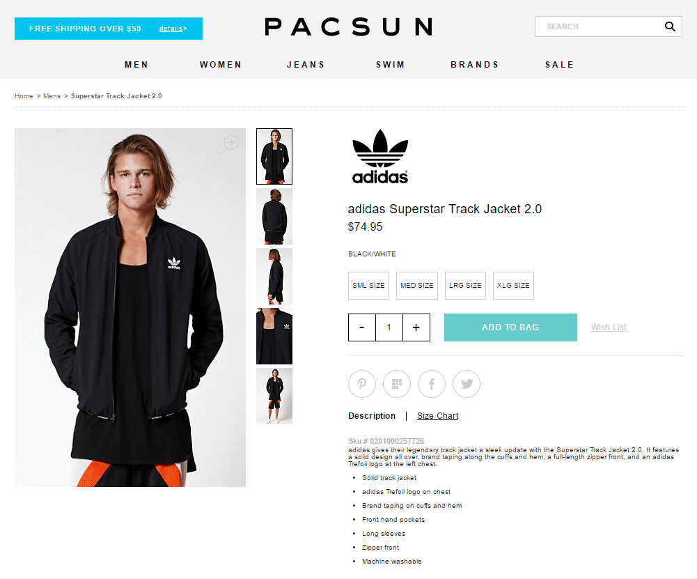
That’s two and both are blue in contrast to the white background. One is calling for your attention with free shipping and another one wants you to add the product to the bag for a checkout. Perfect example of nicely placed call to action buttons.
2. Get email signups
Don’t underestimate the power of emails. According to DMA, 66% of online consumers made a purchase as a result of email marketing message. With an average CTR of 3.57% email marketing is one of the best channels you should be looking to convert on. That being said, let’s see some of the ways you could integrate newsletter signup on your eCommerce website and build yourself a good list of subscribers.
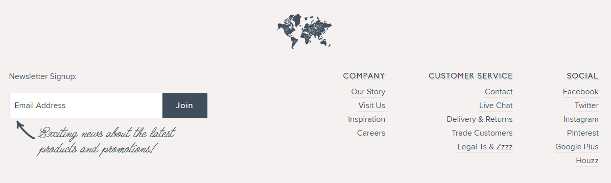
2.1. Standard on-page opt-in form
This one is no-brainer. You can always put one in the footer so visitors who are really engaged with your content and get to the bottom can subscribe to your newsletter.
2.2. After post
If you have a blog section on your eCommerce website, one way to get more subscribers is to put your subscription form just after a single post. If they read your content till the end, why not capture all those visitors so they can get even more of your great content.
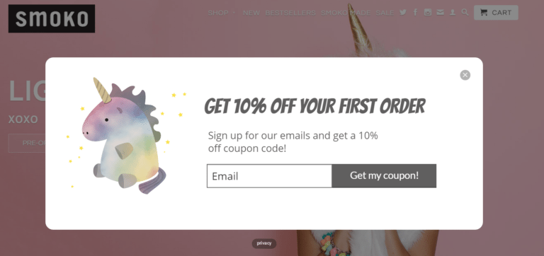
2.3 Pop-up discount opt-in
Pop-ups offering discounts are a really nice way to boost your sales. I know, I know, not a really great tip if you have to shower your visitors with discounts, but it works if you want to increase conversion rate. Don’t get me wrong, I also hate pop-ups who want to take my email, but if they offer me a discount for my first shopping, sure, take my email. If you do get into this, be prepared to see your bounce rate go up together with your conversion rate. Crazyegg gathered some good info that will make you think about using pop-up optin forms. Be sure to check those out.
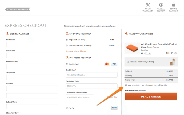
2.4 Checkout checkbox
Another great way of building your email list. Offer your customers and guests easy newsletter subscription option during a checkout. This method will build your email list very quickly.
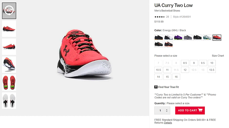
3. Showcase products with videos
More and more eCommerce websites are starting to use video to showcase their products. Did you know that 73% of US adult consumers are more likely to make a purchase after watching a product video?
I was blown away when I entered the shoe section of Under Armour website. Ok, the shoes are great, but I was amazed how they integrated 360 video view.
Another great example is Asos website where you can click on Catwalk and see how the products actually look on their model.
People like visuals. Sure, pictures of a product are great, but with video your customers will get a more realistic feel for the product and it will surely make their choice of purchase much easier. Video is going to become huge, as a matter of fact, it’s expected that 69% of all internet traffic will be video consumption by 2017. Video is booming so be sure to jump in early before your competition does.
4. Use SSL and trust badges
Aside putting testimonials on your eCommerce website, using SSL and trust badges is another great way to build trust among visitors.
SSL or Secure Socket Layer is encryption technology that creates a secure encrypted connection that allows private information flow between visitors browser and web server.
Visitors can see if your website is using SSL by looking for a green padlock in the browser’s address bar.

More experienced shoppers could probably look for an SSL sign before making a first purchase on your site, so make sure it shows on every page. You want visitors to know this immediately when entering a homepage. Google also started giving a small ranking boost to secure https sites so that’s another reason you should consider installing SSL.
A survey made by GlobalSign revealed that 28.9% customers are looking for a green address bar when visiting websites and 24% are looking for a security indicator before purchase. 85% of survey participants said they wouldn’t buy from a website if their data was sent over insecure connection and 55% are afraid of identity theft while browsing online.
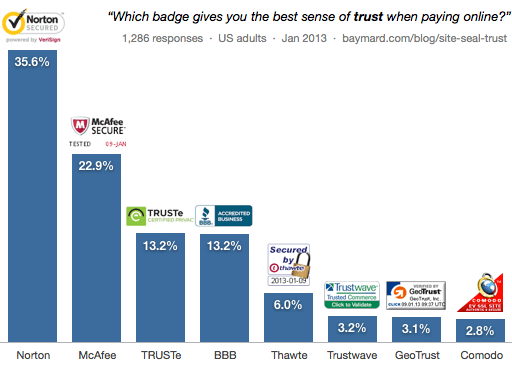
When we talk about badges, a study made by Baymard Institute revealed that most trusted badge is the one from Norton getting 36% of the votes, followed by McAfee 23%, TRUSTe and BBB Accredited both tied with 13.2%.
Trust badges played a big part in DistroKid’s page where the owner has managed to increase conversion rate to 60% with a couple of nice tweaks on the checkout page.
Looking all these numbers, visitors obviously want to know their information is safe, so reassure them by using an SSL and trust badges to see your conversion rate go up.
5. Send cart abandonment emails
Imagine how many abandoned carts are left each day in your eCommerce business. According to the latest quarterly remarketing report from SaleCycle, global cart abandonment rates hold at 74.52%. Are you thinking same as we? We see lots of unconverted sales in this number. With typical cart abandonment rates going between 60% and 80% marketers can use one efficient tactic that can partially save some of the never made checkouts. Send abandoned cart emails to the visitors reminding them there are still items waiting in their cart.
Email reminders have 44.1% open rate and 29.9% clicks leads to a recovered purchase back on site.
Here are couple of tips on how to get most of the abandon cart emails:
Make it personal
If your brand communication strategy lets you, of course. Make your subject line clear and catchy to the user.
Show images
Be sure your email contains images of products left in the cart. Sometimes people can’t remember how the product looked just by reading its name so images are a must if you’re going to be using email reminders.
Include benefits
If you are offering free shipping, money back guarantee, free samples or some other benefit be sure to include it it in the email. There is a big chance user abandoned cart because he didn’t see those benefits when browsing your website.
Watch out on annoyance rate
Be careful with number of emails you are going to send. One email in the first half an hour of abandonment will be enough. If you really want, you can send another one few days latter with coupon code, but that’s about it.
Lets see some good examples.
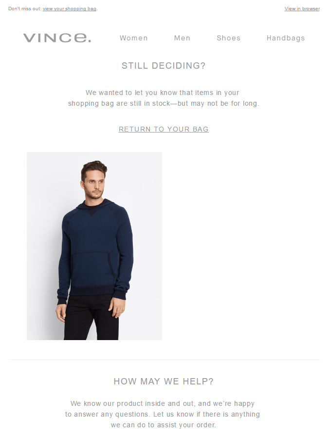
I have registered on Puma website and put a few things in the basket, then I sign out and waited. 4.5 hours later I received abandon cart reminder. Next day at 9.30pm I received another one with an urgency message “Hurry! Quantities are limited.”.
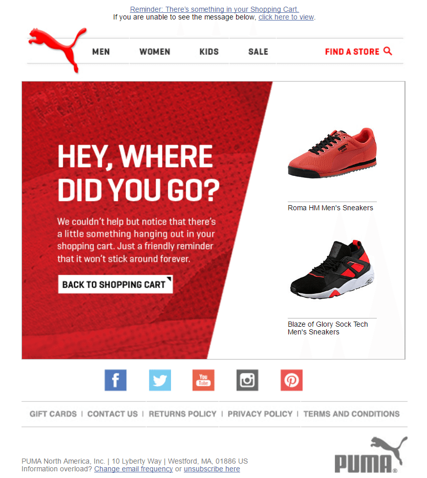
Another email is from Vince which I received 4 hours after registering on their website. As you can see, both Puma and Vince are doing it right, they show your abandoned cart items with their images.
6. Include benefits
Before making a purchase, people like to explore on multiple websites searching for the lowest price. Price of a product plays a big role and to make your visitors decision easier you want them to know what benefits your website is offering that others don’t. It could be first time order discount code, free shipping, money back guarantee, free samples, fast delivery or 24/7 live chat support.
Let’s say, the girl is looking to buy a new special brand lipstick and it happens you are selling it along with a few other websites. We could agree that the first thing she would look at is the price. Your website sells it for 70 dollars, and the other site is selling it for 65 dollars, but you have some great benefits that competition website donesn’t have. You are offering 15% discount code on email signup and a free shipping, but the girl didn’t notice this on your website. It just doesn’t stand out and you missed to convert on this customer who in the end went and actually paid more for the lipstick on competitor site.
Don’t make this mistake again. If you happen to have some benefits which could lure your customers to make the conversion on your website, be sure you are capturing their attention with it. They need to know this immediately when they enter your page. Make it visible on your homepage.
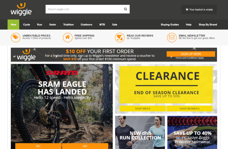
When I was looking to buy bicycle equipment I came across Wiggle website. On the homepage, they nicely displayed benefits which made my decision to buy from them much easier. My cart was qualified for free shipping and 10% off for my first purchase when I signed up for their newsletter. Some other websites didn’t offer benefits, so it was an easy decision for me to buy from this place. You can see the benefits right on their homepage.
7. Create sense of urgency
You can use this one if you want to push your customers to checkout faster. The longer the customer waits and weight options the less likely he will make a purchase. This tactic works great on people who are 50/50 with their buying intent and you want them to act immediately. Let’s see some of the examples how it’s used:
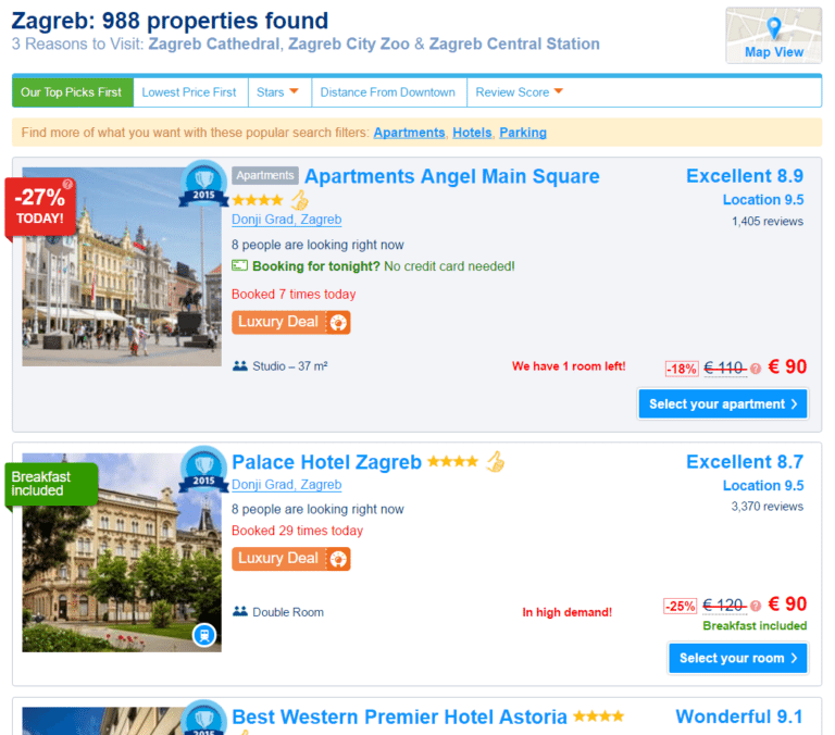
Booking.com is using this tactic very nicely. Message displaying “We have 1 room left” will surely urge visitor to make up his mind faster.
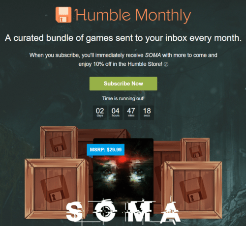
Humble Bundle is a website which offers a bundle of games for a small subscription fee. On a Humble Monthly page they created sense of urgency by displaying a timer and a message “Time is running out”.
That’s it.
I hope you found these tips valuable. If you had success with some other tactic we would love to hear about it.