


Neuralab’s design handbook: navigation that doesn’t turn into a maze
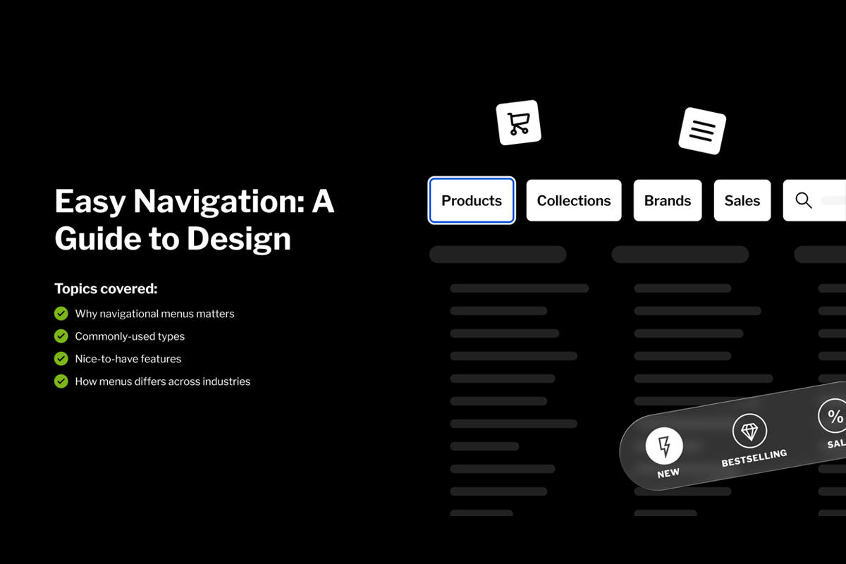
A navigation menu either gets people where they’re going, or loses them somewhere in the header. This handbook covers the patterns behind the ones that work, the principles holding them together, and how the right structure changes by industry. Made for UX designers, product managers, and developers shaping content-heavy, commerce-driven, or service-led sites
Most navigation gets built backwards. Someone lists every page the business wants visible, stacks them across the top, tucks the overflow behind a hamburger icon, and calls it done. Clutch pinned 49% of site abandonment on exactly this kind of maze-like menu structure. On the flip side, Forrester measured a 200% jump in conversion once a business replaced poor navigation with something frictionless. Fixing that starts way earlier than designing the header bar. You have to figure out what people came to do first, then decide how many main paths that actually requires.
What the handbook actually walks you through
- The numbers behind it: Why navigational menus count (and why ignoring them will cost you).
- Core principles: Clarity, consistency, findability, accessibility, responsiveness, and performance.
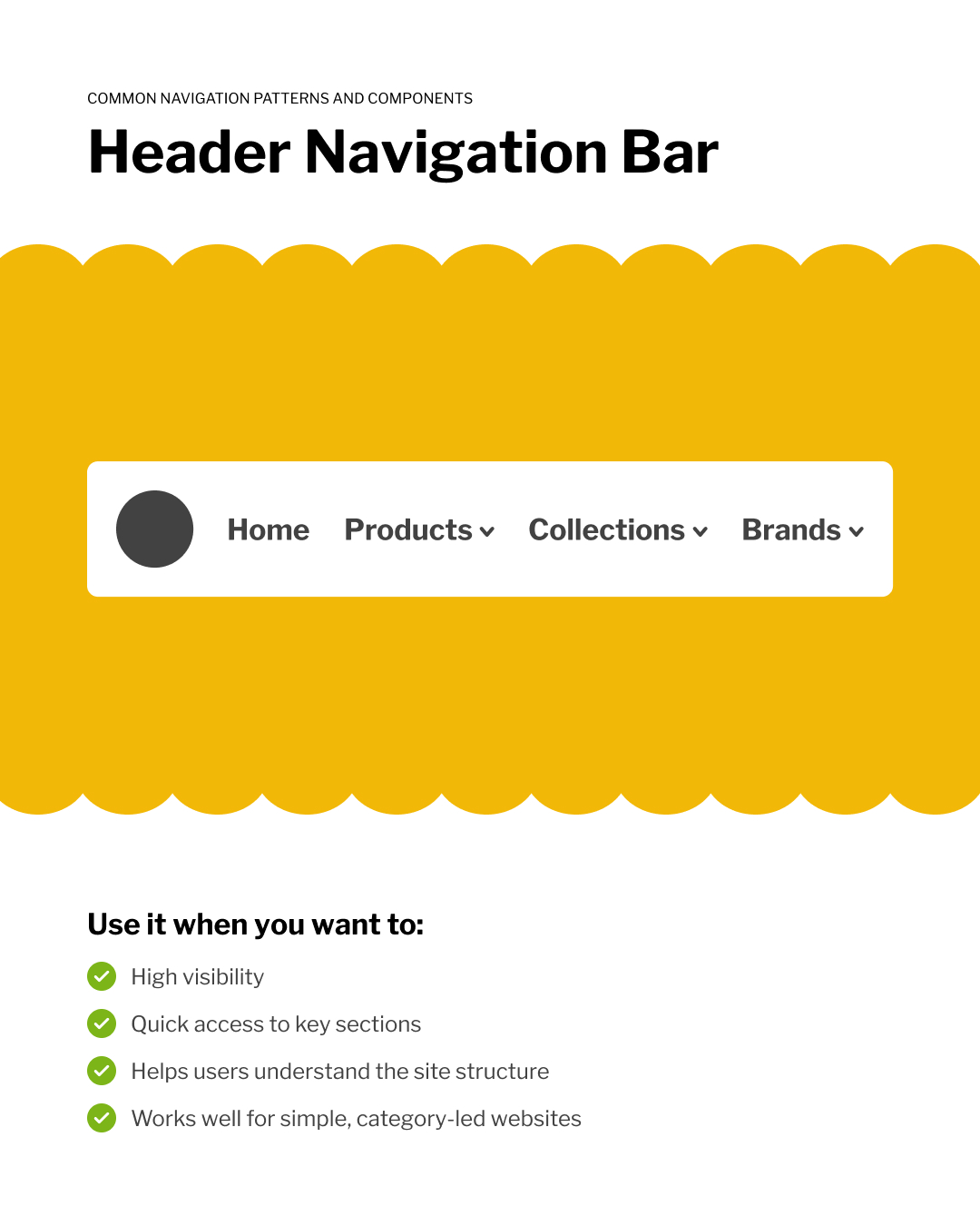
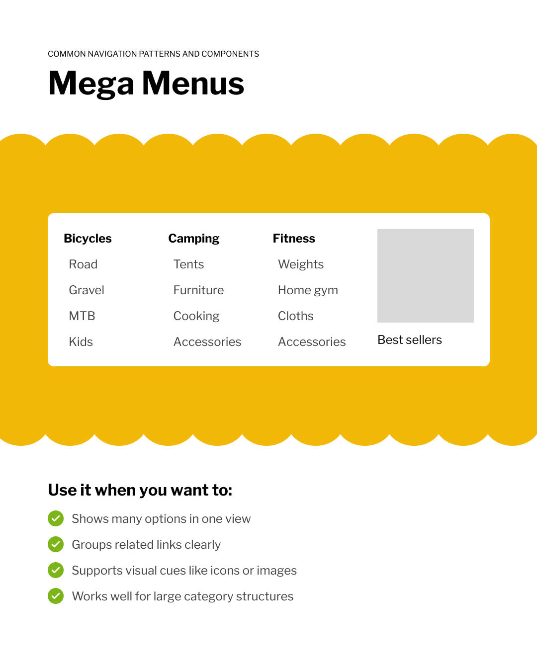
- The usual suspects: Header navigation bars, vertical sidebars, dropdown menus, and mega menus.
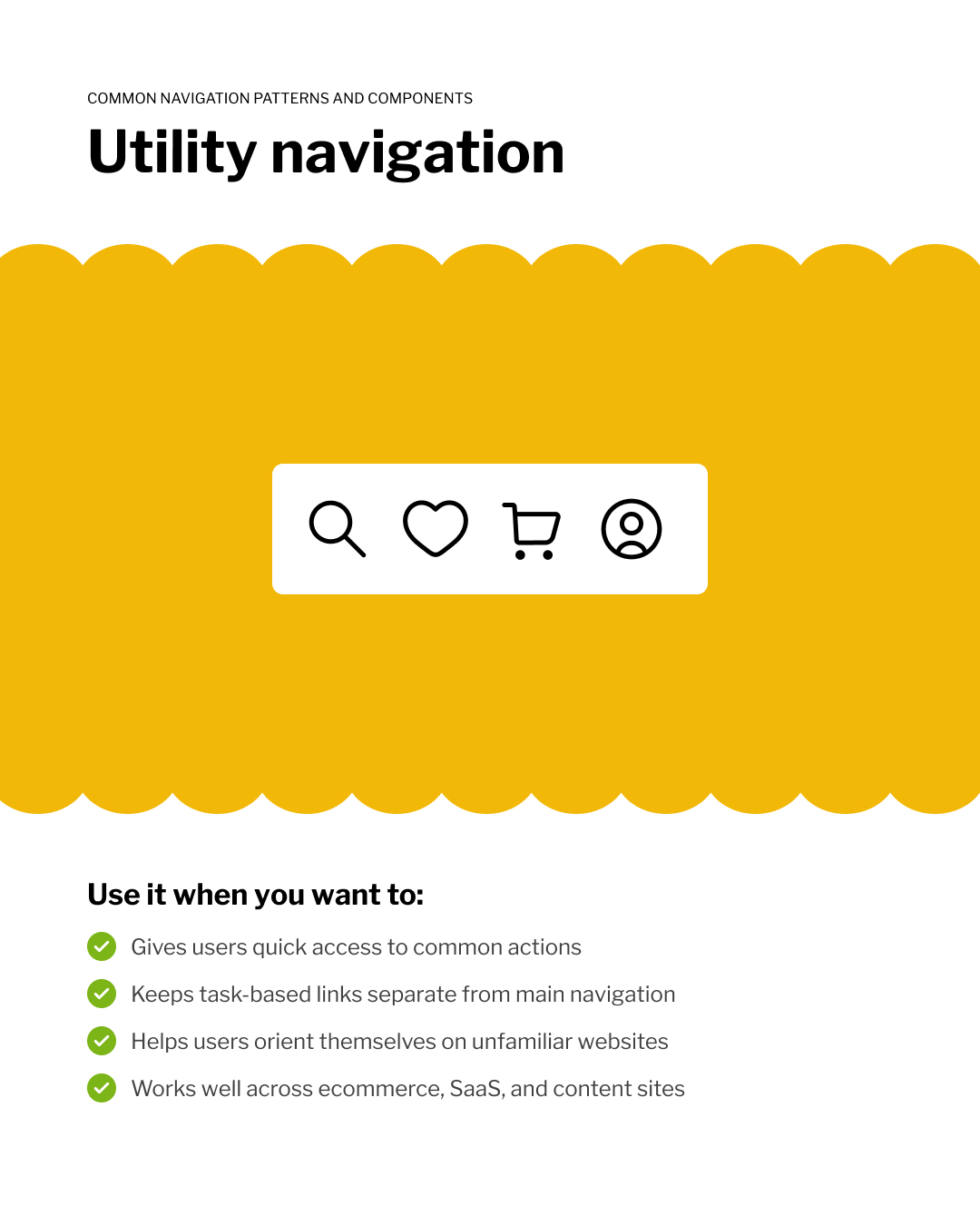
- Secondary lifesavers: Hamburger menus, footer navigation, breadcrumbs, and utility navigation.
- Nice-to-have additions: Sticky navigation, table of contents, and bottom tab bars.
- Industry specifics: How navigation shifts across eCommerce, travel, news, finance, and B2B sites.
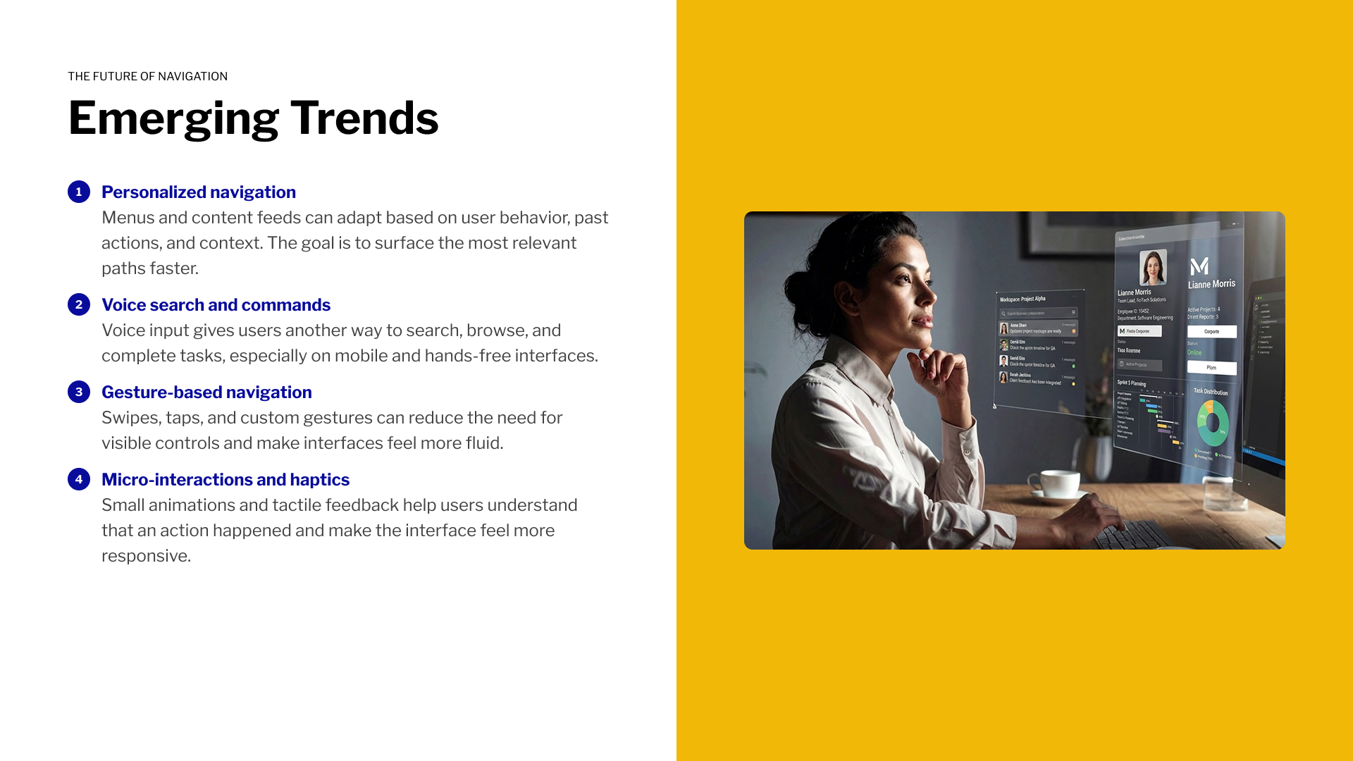
- Where it’s all heading: Personalization, voice and gesture input, and AR.
What can go wrong?
A nav bar can look absolutely airtight in a static mockup and still completely confuse the first real visitor who touches it.
Think about it:
- Clicking a parent item in the header: Does it take you somewhere, or just pop open a submenu?
- Scrolling past a sticky bar: Does it smartly get out of the way, or does it permanently eat up 20% of your screen space?
- Following a breadcrumb: Does every level actually link back, or is it just sitting there for show?
- Switching to mobile: Does the priority order survive the transition, or do the buttons people use most get buried at the bottom of a dropdown first?
Go poke around the real thing
We built this so you don’t have to start from scratch. The interactive handbook lives on Figma Community right now.
Duplicate the file, argue with the choices you don’t agree with, borrow whatever’s actually useful, and for the love of good UX – leave your own navigation a little less like a maze 😉

A Boletus aficionado who loves to get lost in the woods. He's still holding dearly to his OG Canon 5DmII while claiming that the play button is the apex call-to-action button on the web.