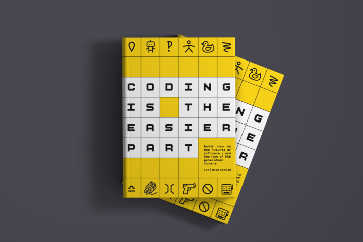


Neuralab’s design handbook: filters that actually guide users
Discover how to design filtering experiences that actually help users find what they need. Learn why filters matter, explore common filter components and logic patterns, and see how filtering changes across industries. Built for UX designers, product managers, and developers working on search-heavy, content-heavy, or commerce-driven products.
Our new Design Handbook covers the patterns, logic, and UX decisions that shape how people narrow results, compare options, and get to something useful faster. The full interactive handbook is available on Figma Community.
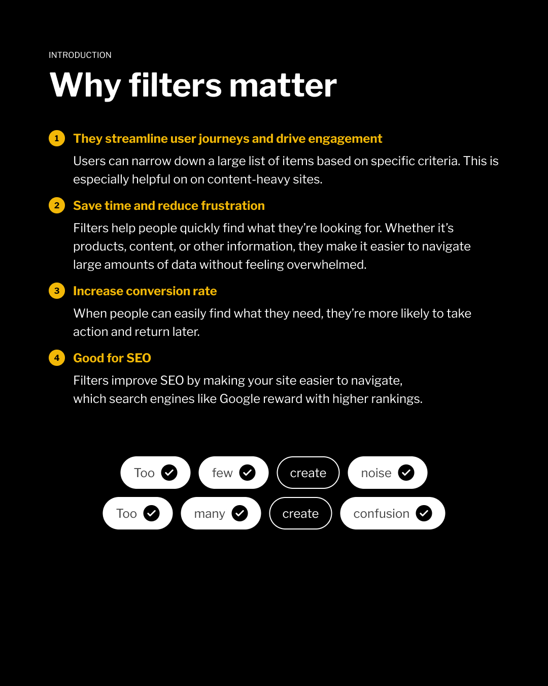
Filtering usually gets treated like a layer of controls added near the end of a web project. That is how teams end up with long filter lists, weak labels, and logic nobody can explain. Some products hide filters behind a neat little button and call it clean. Others expose every possible attribute and call it flexible. Both can slow people down. Good filtering starts with stronger choices: which filters deserve priority, which ones can stay hidden, which labels match real user language, and which combinations should never lead people into a dead end.
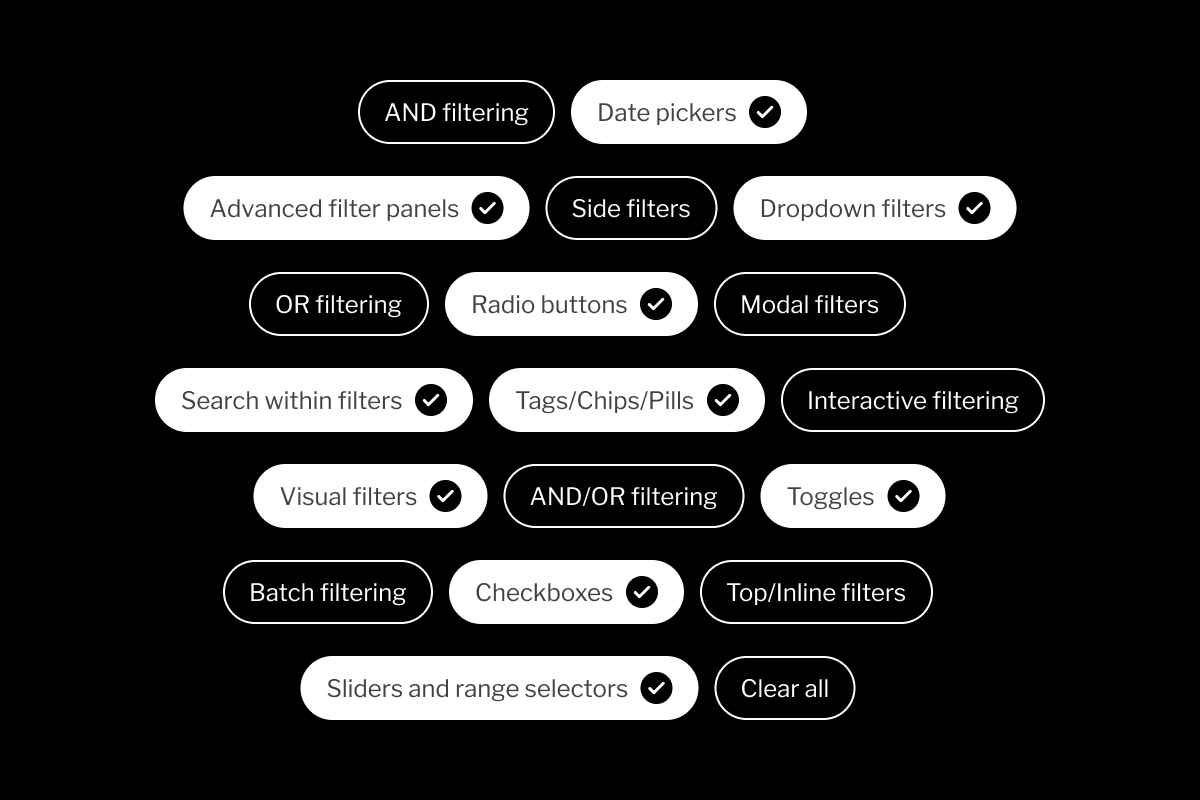
The handbook covers the basics and the bits that usually cause trouble later:
- why filters matter
- dropdowns, checkboxes, radio buttons, sliders, tags, toggles, date pickers, and visual filters
- interactive vs. batch filtering
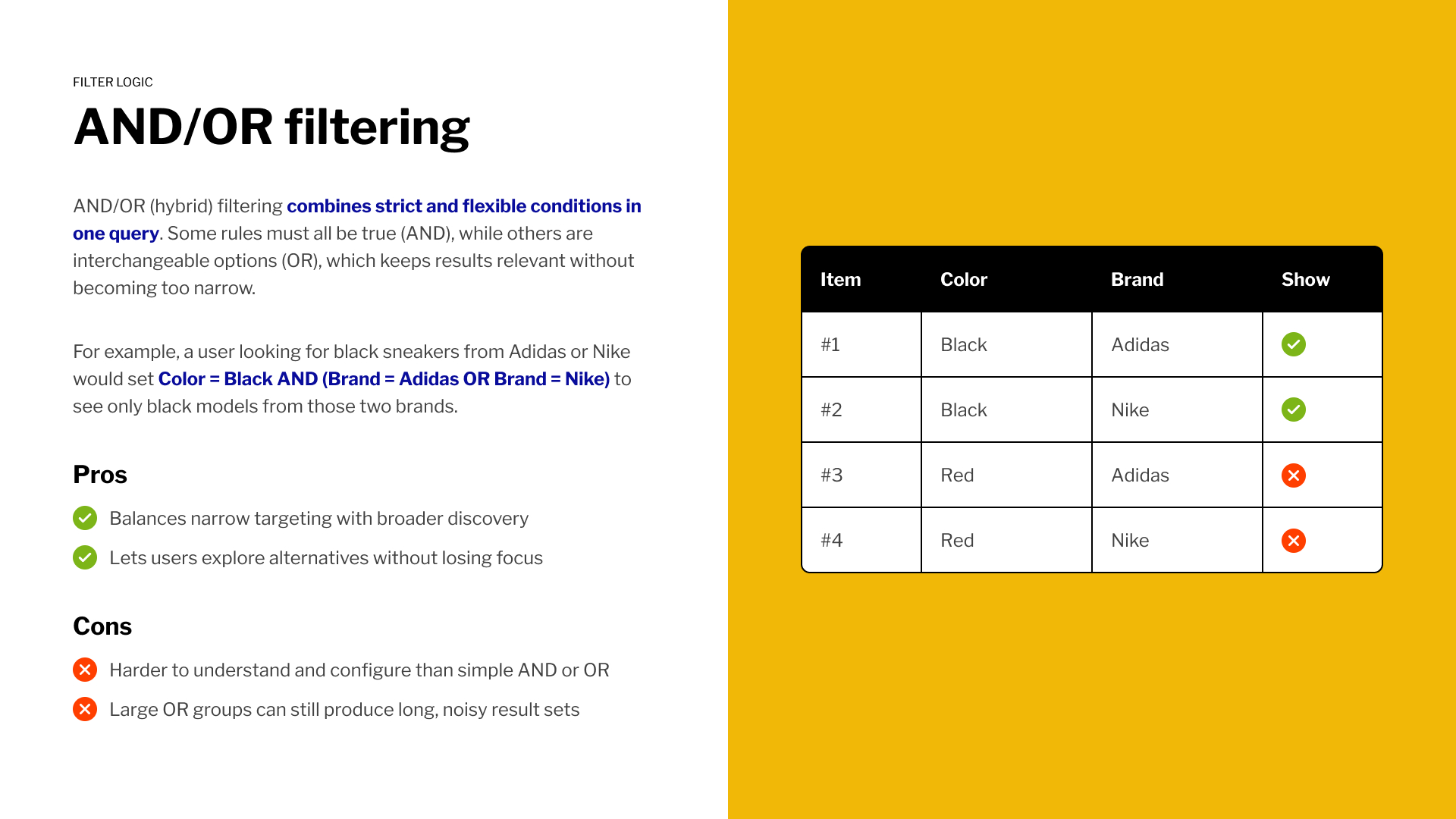
- AND, OR, and hybrid AND/OR logic
- filter placement: top, side, and modal
- industry-specific filtering for eCommerce, travel, SaaS, real estate, and recruitment
- key takeaways for keeping filters usable, visible, and recoverable
The part teams usually tackle too late
Filter components are visible, but filter logic is where things get messy. A checkbox, dropdown, or modal can look perfectly fine and still return confusing results. The real decisions sit under the hood:
- Does each new selection narrow the list or expand it?
- Do results update instantly or after users click Apply?
- What happens when a filter combination returns nothing?
- Do recurring filters stay in the same place across categories?
When these rules are unclear users stop trusting the results, but when they’re handled well, filtering feels obvious even on complex products.
Explore the full handbook
The full interactive handbook is available on Figma Community.
Open it, duplicate it, inspect the patterns, disagree with a few things, click on the like button, steal the useful parts, and make your next filtering flow less annoying.
A Boletus aficionado who loves to get lost in the woods. He's still holding dearly to his OG Canon 5DmII while claiming that the play button is the apex call-to-action button on the web.