


Coding Is The Easier Part – Book Covers & Design Tradeoffs
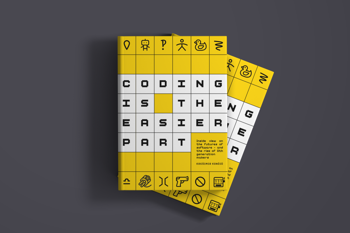
Hey folks, I need your help with the cover. A book I’ve been writing for years ships soon, and the visuals are one the last things standing between me and Amazon 🫣
The piece is called Coding is the Easier Part – an inside view on the future of software and the rise of 5th generation makers. The title is the argument. Pure creation was never the hard bit, and everything around it was. Naturally, the text is oriented towards software makers, but I hope it will also reach everybody who’s working with them.
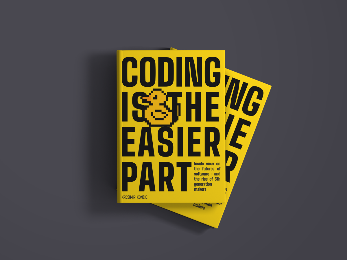
Frequently exquisite Neuralab designers – Martina Babić & Emanuele Lizzi – made 6 versions and our favourite is #1.
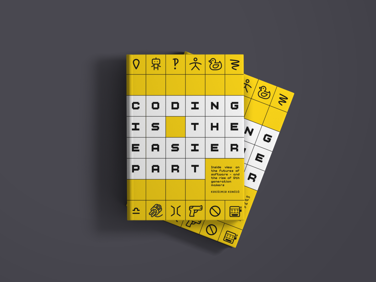
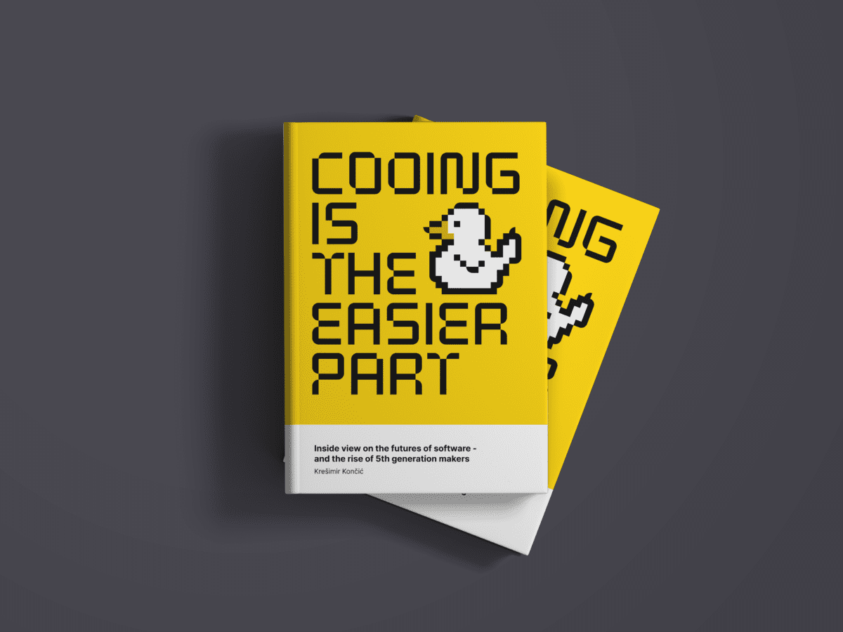
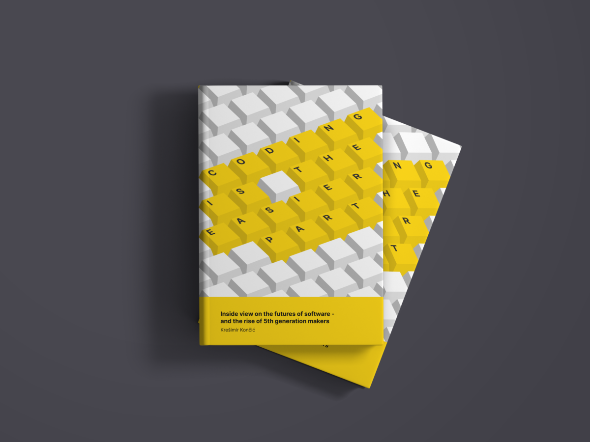
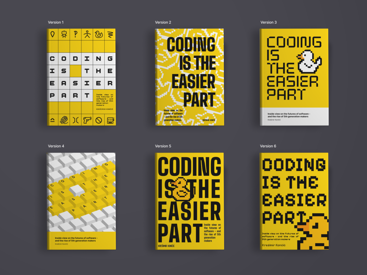
Every icon in it is a load-bearing motif from the book itself: the rubber duck, the slot machine, the astronaut. The square framework also hosts a secret connection. It’s also the cover that doesn’t look like every other bold-type-on-colour business book of the last five years.
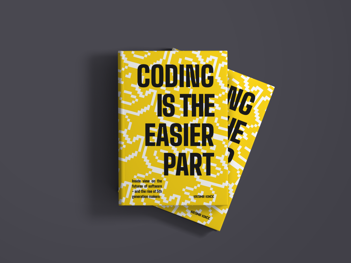
Probable counter-argument is that #1 is harder to read at Amazon thumbnail size. #2 or #5 (the pixel duck) wins that fight clean. So one question is bugging me: is the differentiation worth the legibility tradeoff?
If you build software or work with people who do, I would love some push back from you. Especially on #1. 🙏 And for context, here are a few well-known books from the same shelf.
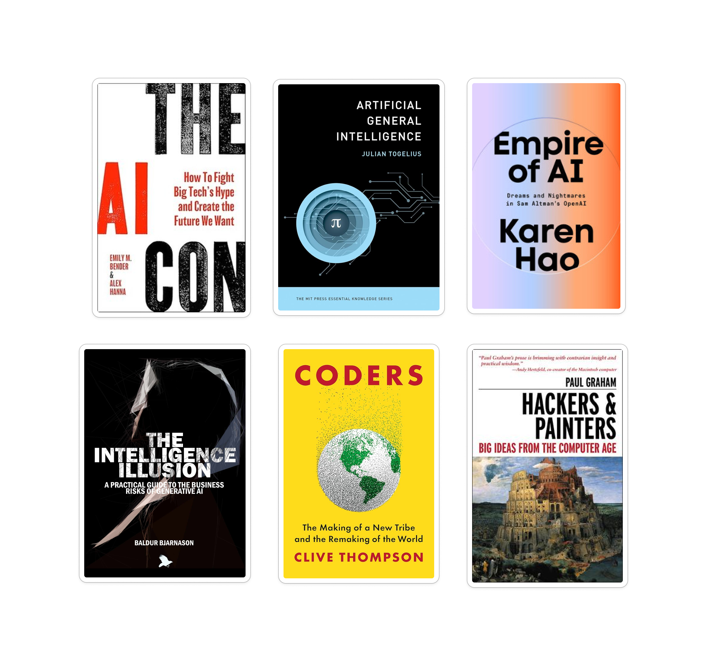
So here’s my ask – tell me where you land. Differentiation with #1, or thumbnail-legibility with #2 or #5. A single number and one line on why is plenty. Fittingly, the book argues that the making was never the hard part – everything around it was. Turns out that includes its own cover. You can leave the comment here on LinkedIn – https://www.linkedin.com/feed/update/urn:li:activity:7465637920121573396/

Ex QBASIC developer that ventured into a web world in 2007. Leading a team of like-minded Open Source aficionados that love design, code and a pinch of BBQ. Currently writing a book that explains why ‘coding is the easier part’ of our field.