


5 Best Call to Action Newsletter Examples
If you’re coming from the digital marketing sphere, you will probably agree with the fact that e-mail marketing is one of the most underestimated digital marketing channels.
Some say that email is dead, some say it will never die. The truth is that over 100 billion emails are sent and received every day-Radicati report. Hell, even 66 percent of online consumers are making a purchase as a result of an email marketing message. People favor emails in business communication. You need one for shopping online, to exist on social networks, exchange documents, pictures and for pretty much any serious online activity. I would say having an email is just like having an ID card. It’s your ticket to the online world.
Nothing can replace emails! At least anytime soon. So with so many emails sent every day, digital marketers must have become experts on how to create newsletters. I decided to check this.
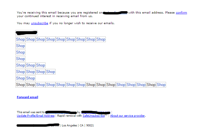
I asked a few of my colleagues to help me by forwarding me all sorts of newsletters they’ve been receiving in their inbox. I’m not a newsletter junkie, but was happy to check out some of these for the purpose of writing this article, all 150 of them. After I passed the 30th one, my happiness and excitement started to fade. Totally exhausted, I have found only one or two which were really appealing to me. The rest? They all looked the same, some of them really popping out visually like this one:
Beauty, isn’t she?
So, what did I search for?
Visually attractive, simple, short, deal included newsletters. Is it too much to ask? While these are all important things I was looking for, somewhere in my mind I was hoping to find one thing, the one thing most marketers fail to deliver when creating newsletters. One thing that will lure me to click that buy, download or submit button. It’s that magical call to action or simply CTA. As we already mentioned, online consumers pretty much purchase things as a result of an email marketing message, and when we talk about “email marketing message” we actually mean on CTA. While skimming through the bunch of these newsletters, this was the thing I was searching for, probably without knowing.
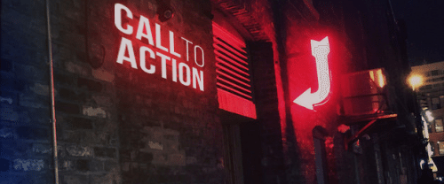
What is Call to Action anyway?
It is just that. It can be anything or a combination of things. Color, image, number (price, discount, percentage), a word or a whole sentence that calls for your attention. CTAs in newsletters want you to buy a new product, download an ebook, fill out the survey or subscribe to even more newsletters. But mostly it comes in a form of a button.
So does your newsletter have one? Probably. But is it visible, clear and calling for attention?! That’s the question. If you’re unsure how does a proper CTA looks like we gathered some nice examples of CTA newsletters that have one. So let’s see it together:
1. Come Sale Away
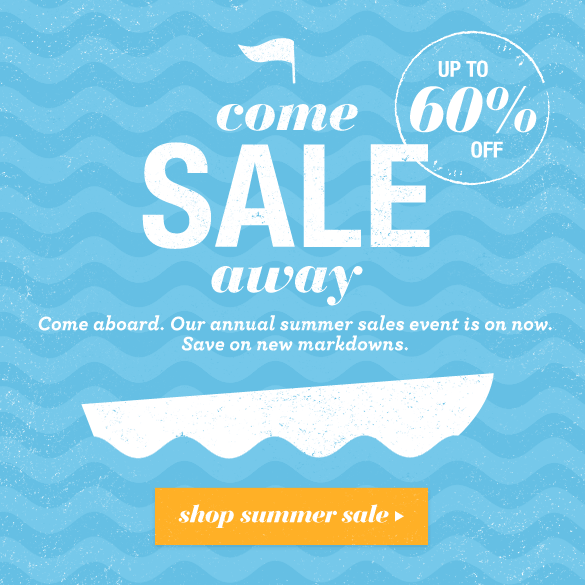
This is one of the nicest gif newsletters examples around. It has one clear CTA. It’s the orange “shop summer sale” button. By using 3 colors, white and blue as cold colors, orange colored button just attracts views (probably clicks too). And yes, I also noticed that 60% part. See how that number is made bigger in between “up to” and “off” words? That’s what most people see when they open this newsletter, and they are made bigger on purpose.
2. 24 Hour Flash Sale

Bright and in contrast with other parts of this newsletter, “Shop now” button calls for attention the most. Together with ticking clock, this newsletter wants you to act immediately by clicking on the button. It overwhelms you with an urgent feeling that you might miss a good deal if you don’t act fast.
3. Kickz sale
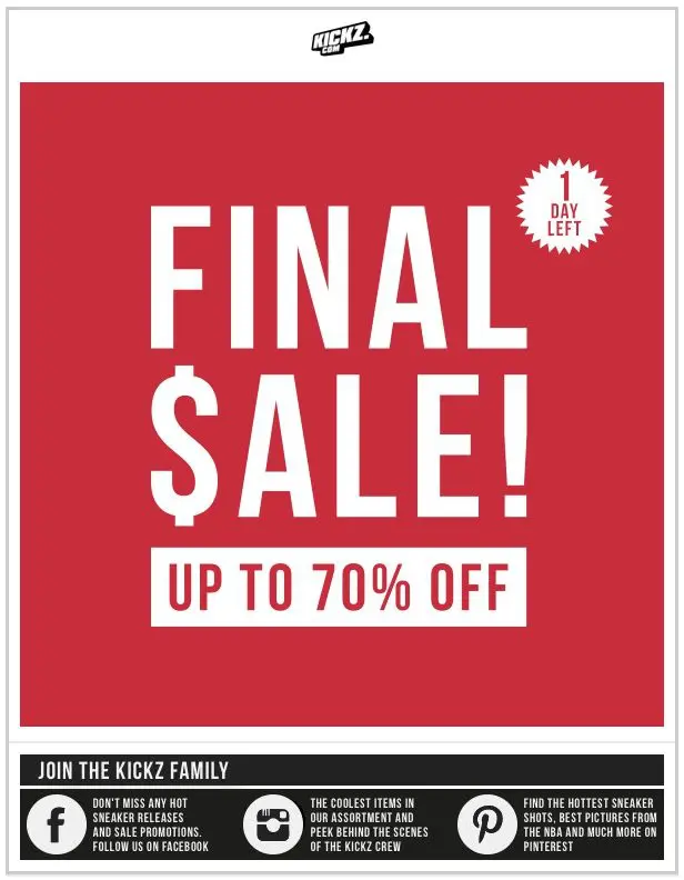
Kickz newsletter uses the bare minimum of 2 colors in this newsletter. It’s simple and effective. Red color is the most popular color used for sale signs and it’s a sure way of attracting people’s attention. This and other Kickz newsletters use red the most. In their newsletters there is always one red section that promote sales.
4. Joie
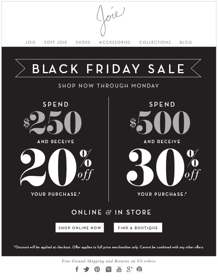
Joie newsletter for Black Friday sale has two call to action buttons. “Shop online now” and “Find a boutique”. Although you can have more than two call to actions it’s recommended to keep it minimal. You don’t want to confuse your subscribers with too many of them. Focus your readers on one or two CTAs in your newsletter.
5. J. Crew
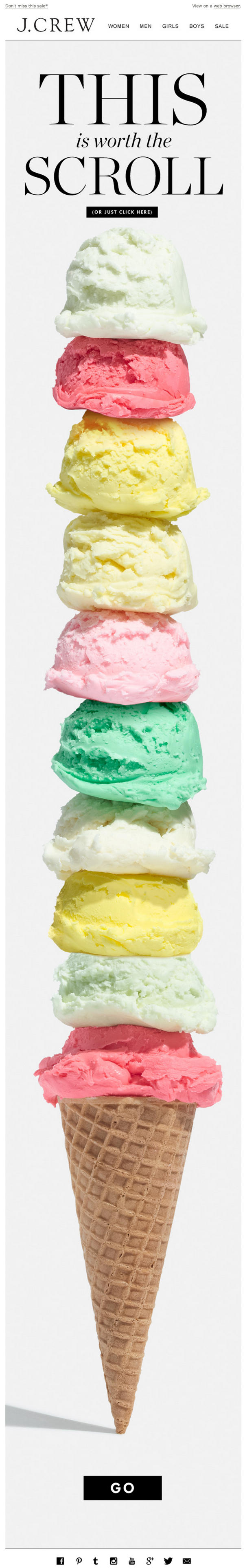
J. Crew’s first call to action is on top. By communicating that it’s worth scrolling, you get to the second CTA at the bottom. Black “Go” button in contrast with the light background wants you to “go for it” and visit the J. Crew collection. Middle of the newsletter is full of delicious colors, but it’s stops near the bottom where clean space is reserved for Call to Action button.
So did you noticed that most of these examples have something in common?
They are mostly one page sale newsletters and their CTA is a button. Sale newsletters are mostly concentrated on having a highly visible call to action buttons and that’s why they caught my attention. One page or better say no scrolling newsletters are effective in a way, when subscribers opens one, they want to see information in the upper fold (Upper fold or above the fold is a portion of an opened web page visible to the viewer without scrolling). This is important because subscribers take a quick look at the content and if there’s too much information to process, they just gave up and close the newsletter. My advice is; keep it short, keep it informative and above the fold. J. Crews example is different. They actually challenged the viewer to scroll down the newsletter by using a nice call to action message. It’s fine if you decide to make a long one, but keep it clean and simple as possible for the subscribers.
Remember: Call to Actions could make or break your newsletter campaign. After going through this, there’s no way you can go wrong with creating yours…