


Can UX patterns crash your eCommerce ecosystem?
When it comes to e-Commerce, there are a number of UX practices that can undeniably be harmful to the business and should be avoided at all costs. Such as slow loading, confusing navigation, poor filtering and sorting options or lack thereof, missing or hard to find search, weak content, low-quality images, confusing check-out process or any of the dark patterns. However this article is not covering basic practices and fundamentals, rather focusing on some more specific patterns. It aims to find the good in those bad and the ugly patterns, acknowledge the primary idea but find a different solution.
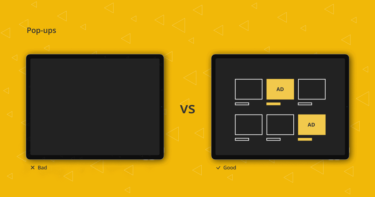
Pop-ups: Comic Sans of the ads
The bad
Upon googling pop-ups, almost all of the top results are on how to disable them. The public consensus seems to be that they are annoying. So how are they still a thing? Are pop-ups like Comic Sans, in a way that we just love to hate them? It’s very interesting how hated they are but at the same time, researches show that they actually bring conversion. Most often than not it’s subscriptions to a newsletter. When pop-ups first appeared they were extremely intrusive, opening new windows and cluttering the screen with ads. By now the things have changed and Google is penalizing mobile intrusive pop-ups that tend to interfere with the experience and block the content that the users seek. So for pop-ups to stay relevant in this day and age, they have to be well thought-out. If you’re determined to use them and positive that it will benefit your business, make sure that they are well-designed and adhere to Google’s rules so your SEO doesn’t suffer.
The good
There are other options and perhaps that particular message doesn’t need to be in a pop-up format. They appear on the screen and are quickly dismissed, so for the message to be visible at all times it can be placed in the mega menu or inside the content of the page. This way it’s easily accessible and the constant presence won’t go unnoticed by our subconscious mind. That is how native advertising works and Instagram is a prime example of blending ads with the content of the feed while still making the distinction clear.
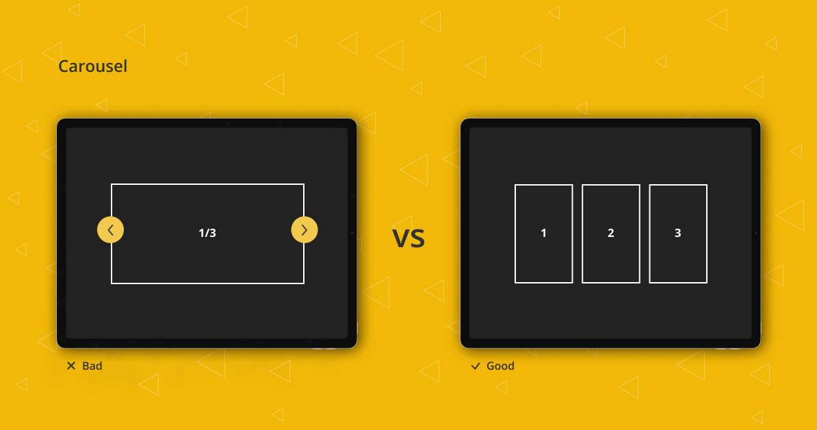
Spin that wheel
The bad
Even though the carousels are declining in popularity on e-Commerce websites (especially on Homepage), they are still very much present. Granted, they got a bad rep because of marketing carousels. They are large image banners in a slider placed on the Homepage, most likely in the hero section, and they do very little to nothing in regard to the conversation rate. They create banner blindness and are often overlooked and completely ignored as they look like ads instead of something that portrays relevant information. Throw in automatic rotation and your user will run the other way. Never make users feel helpless, always give them control over their actions. If you absolutely have to use automatic rotation (although it is not advisable to rotate slides automatically) let them know the duration of the slide, give them a preview of the next slide and most importantly make sure that it is touch-friendly. Even with all that, carousels still encounter issues with accessibility and having a highly accessible website is no longer only a plus but a very important requirement. Numerous researches have been conducted to determine just how effective or ineffective carousels are. One that is most often referenced was conducted by Erik Runyon in order to test Notre Dame University site’s carouse. The results showed that only 1% of total visitors clicked on the content of the carousel and 84% of those interacted only with the first slide. So if your user needs to see the content, it has to be accessible and hiding it in a carousel is a sure way to make it go unnoticed. And if you’re still thinking about whether or not to use a carousel on the Homepage of your e-Commerce website, maybe this interactive guide will clear your doubts.
The good
Using carousels on the Homepage isn’t advisable, but that isn’t to say they should be completely eliminated. However, when using a carousel, use it wisely. They definitely come in handy when vertical space is limited, like on our smartphones, and especially if used on product detail pages as image galleries. Those sliders advance with the use of touch gestures rather than on their own and are used in a specific context. For that reason, they are much more engaging than a marketing carousel on the Homepage. Another reason why they work better on mobile devices is that swiping is a more natural pattern when it comes to smaller screens. Some have recognized and leveraged the swiping motion and even patented it. We all know who that is. There are lots of options to go with instead of a carousel and they all depend on your specific needs. If you have banners you’d like to highlight place them in different sections of the page, place them inside mega navigation, or even make different landing pages for each. Some other alternatives to a carousel include a collage of images, a grid approach, a full-screen hero image, using typography or Call-to-Action.
No page parking for you
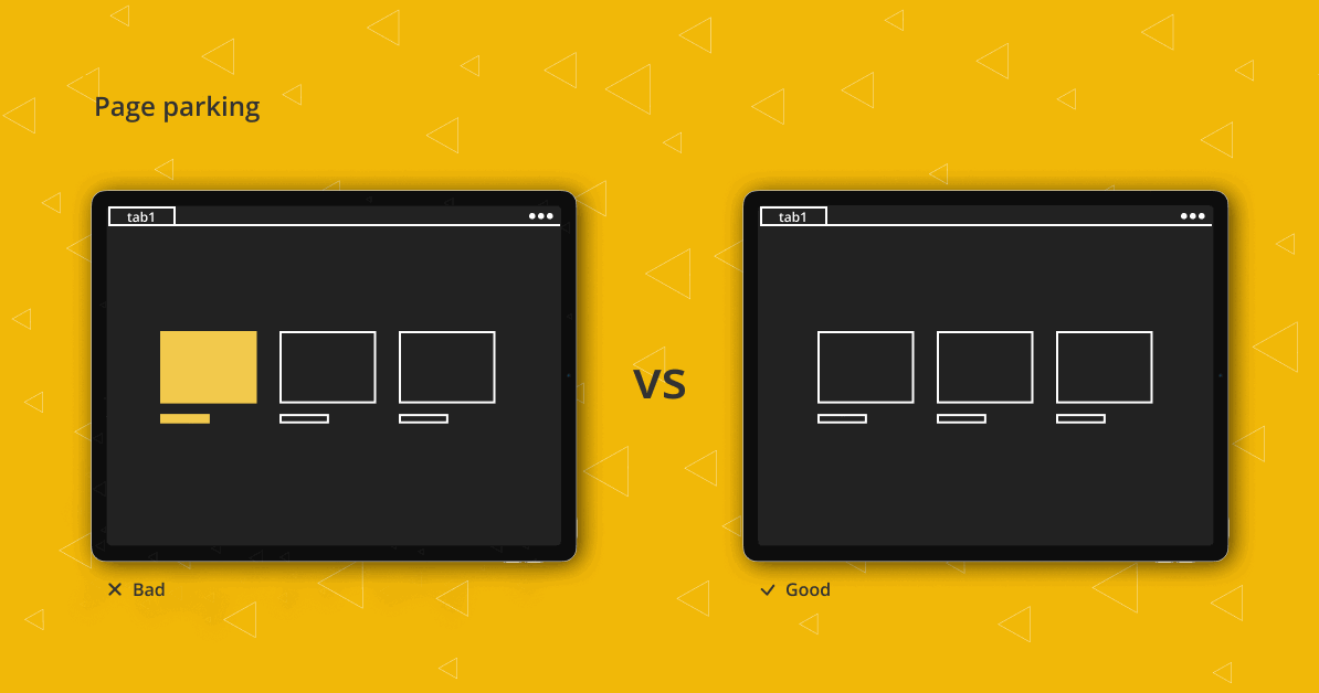
The bad
Well, the bad thing about page parking is that you can’t do it. Some might ask what is that and why would that matter but studies show that young adult users engage in page parking, or in other words – they like to open multiple pages in different tabs. Now, this isn’t often the case with e-Commerce websites, but there are some that do not have a single product page only a pop-up screen with product information.
The good
This kind of behavior is often linked with reading the news, conducting research or most importantly – shopping. It is extremely useful for comparing similar items as they are open simultaneously and can be revisited at any time. Since the users are becoming more impatient and have a shorter attention span, those parked pages often serve as a reminder of the items they are interested in. The before-mentioned pop-up as a quick view is actually a very nice feature if it’s in addition to a classic product page. This way it caters to both price-comparing users and the ones just skimming the collection.
Animation overkill
The bad
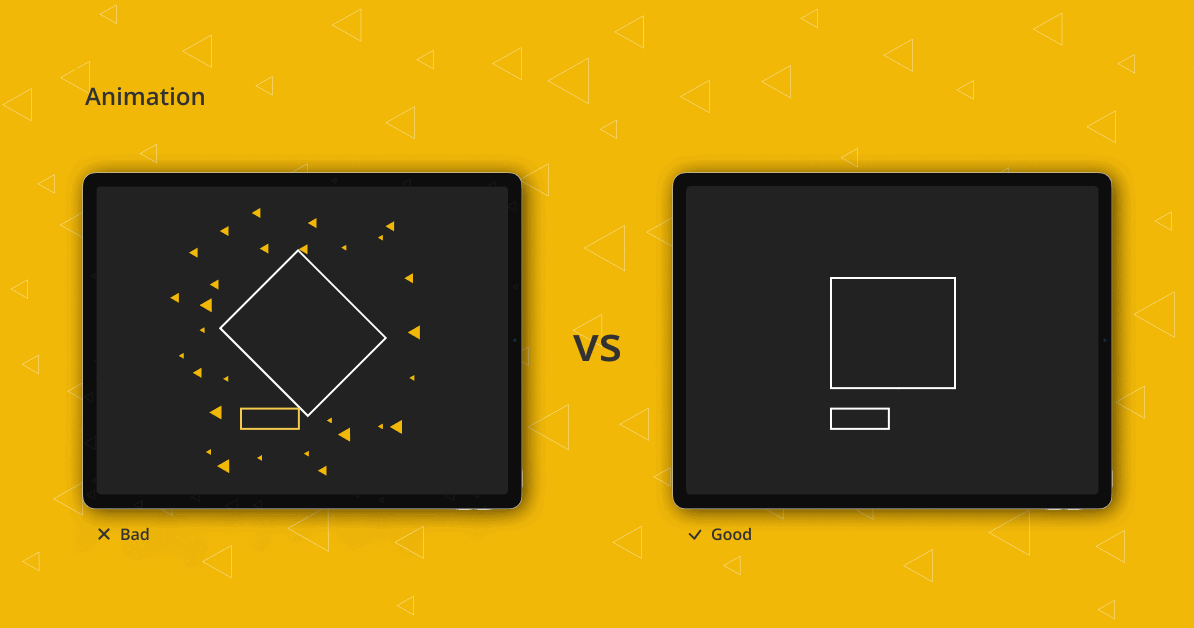
When it comes to animation in e-Commerce, less is always better. Going overboard with animation on your webshop will discourage and distract your users. Leave the animation on the Homepage or better yet, the landing page. When browsing the product archive, users shouldn’t be overwhelmed and should have a seamless experience. Animation needs to have a clear purpose, not just be aesthetically pleasing. Sure it’s nice to have something unique to set you apart from your competitors but not at the price of the user’s flow or site’s performance.
The good
The best way to enhance the user experience and draw attention to a certain part of the page are micro animations. Let those subtle movements do the talk. Another practice is to have a presentation page tailored specifically to a smaller line of products. These websites aren’t meant for shopping but to evoke emotions and create an experience. Examples are Kopke and Calem wines. The user will browse the site, emerge into their story and decide to try some of the wines. However, this isn’t the usual route and it will only be done the first time. Next time when the user knows what they want, they’ll go straight to the simple and easy-to-navigate webshop.
Go (too) big or go home
The bad
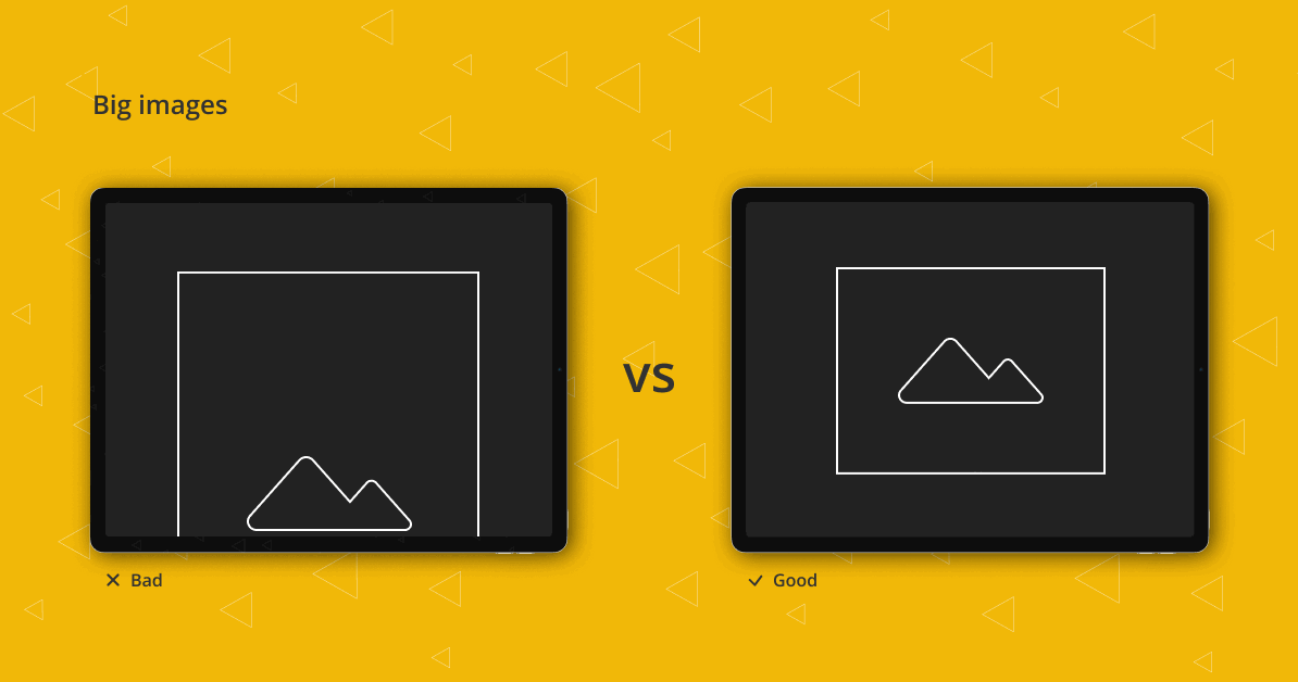
Going big with typography and images can be very tempting. Like some say, the bigger the better. But that might not always be the case. The same rule used for animation is applicable when it comes to large images or typography, and it’s not to design for “likes”. When shopping, users want to see the entire garment or a product without having to scroll to find the rest of it. Another problem with big image sizes is that it slows down the load time, and when it comes to e-Commerce websites (or any website in general) speed is crucial. Uptrends article mentions the effect of slow performance on a website’s credibility and states that 75% of users that encounter slow, freezing or crashing websites are discouraged from continuing with the purchase.
The bad
Going big with typography and images can be very tempting. Like some say, the bigger the better. But that might not always be the case. The same rule used for animation is applicable when it comes to large images or typography, and it’s not to design for “likes”. When shopping, users want to see the entire garment or a product without having to scroll to find the rest of it. Another problem with big image sizes is that it slows down the load time, and when it comes to e-Commerce websites (or any website in general) speed is crucial. Uptrends article mentions the effect of slow performance on a website’s credibility and states that 75% of users that encounter slow, freezing or crashing websites are discouraged from continuing with the purchase.
The good
Hitting the nail on the head and creating something that serves the purpose and pleases the design community is extremely hard but not impossible. However, it is important to never lose sight of the primary goal of the website. Large images can be a good thing if that’s something that is applicable to your niche. Perhaps your user would like to see the product up close rather than in full and all those details are of use to them. Just don’t forget to optimize those images.
Members-only club
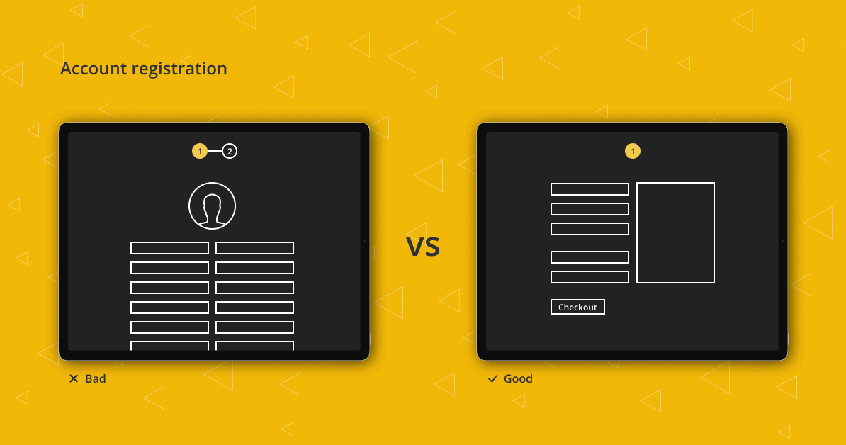
The bad
Chances are, the average user already has more registered accounts than he or she can remember. After a while, it becomes too much and they start to carefully pick and choose only the ones they’re sure will be used. This means that the first-time shopper is highly unlikely willing to register before making the first purchase. This also goes for returning shoppers who can’t seem to remember their login information. As described in this article, one of the main issues that prompt users to abandon their cart while online shopping is mandatory account registration. So much so, that one deceptively small change can make a huge difference in a company’s annual revenue. That step was initially intended to save shoppers time, as it’s supposed to save all the important information, but it turns out it actually brings more harm than good.
The good
On the flip side, satisfied customers are more likely to spend extra time and register if they’re planning on coming back for more. Having an account offers some useful features and it is absolutely a good thing. However, it shouldn’t be the only way to finalize the purchase. Offering the possibility to make a purchase as a guest is a sure way to not exclude those who just want to shop without commitment. Don’t drive your customers away with unnecessary steps, give them a choice and everyone will be happier for it.
Experiencing pattern problems? Connect with us for more UX solutions. We have an answer for all your eCommerce dilemmas.
Her passion is UX / UI, and on top of that, she writes briefings better than most PMs