


Keep the motion, lose the weight – Lottie animations in web production
Sometimes the smallest design details cause the biggest frontend headaches. A button hover, a tiny success animation, a looping illustration in the corner of a section. They look harmless in Figma. Then the design has to become a real website.
Our designer Martina arrived at my desk with the kind of Figma file that makes a developer happy and nervous at the same time.
The new Neuralab website looked solid. The layout was clear, the typography was restrained, and the color choices were under control. What gave the design its character were the small animated details scattered through the interface: a looping illustration next to a feature list, a soft hover movement on a primary button, and a compact success flourish after an interaction. Nothing looked like a big, cinematic hero animation. These details sat in that thin layer users rarely notice consciously, but immediately feel whenever it is missing.
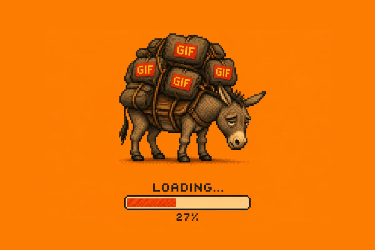
Then Martina said she wanted all of it live on the production site and casually suggested exporting everything as GIFs. That single sentence contained a decade of frontend tradeoffs: high-quality GIFs would bloat the pages, while aggressively compressed GIFs would simply look bad. Those tiny flourishes were about to carry a disproportionate amount of weight on a website that still had to be fast, search-engine-friendly, accessible, and stable under real traffic.
As Mick Jagger famously sang, “I’ll never be your beast of burden.” In web development, heavy animations can quickly become exactly that.
This article came from that exact moment and later became part of my Woosesh and Weblica talks. It is about microinteractions, motion design, Lottie, JSON, and the practical decisions that happen when a polished design has to become a production website.
What are microinteractions, and why should you care?
Microinteractions are small, task-oriented interactions that provide feedback to the user.
When they are designed and implemented well, we barely notice them, but when they are missing something feels off. The interface feels cold, delayed, unresponsive, or slightly untrustworthy. Dan Saffer, author of Microinteractions: Designing with Details, described microinteractions as “an exercise in restraint.” And that restraint is the key. A microinteraction should not perform for the sake of performing. It should answer a user’s question at the exact moment the question appears. They are not decorative elements. They serve a crucial functional purpose in boosting user engagement. A hover state tells the user that an element is interactive. A loading animation tells them the system is working. A success state confirms that an action went through. A validation message tells them what needs to be fixed before they continue.
In eCommerce, this is practically an existential question. A user who clicks “Add to cart” and sees no feedback has to guess what happened. Did the click register? Is the product in the cart? Should they click again? A tiny animation or state change can remove that uncertainty before it becomes friction.
The anatomy of a microinteraction
Saffer breaks microinteractions into four parts: trigger, rules, feedback, and loops or modes.
A trigger starts the interaction. It can be manual, like swiping down to refresh a feed, or automatic, like a red badge appearing when a new Slack message arrives.
Rules define what happens after the trigger. Gmail’s “Undo Send” is a good example. The system delays delivery for a few seconds, which gives the user a short window to reverse the action.
Feedback is the part the user sees, hears, or feels. A progress bar during upload, a button changing state, or a subtle vibration after payment all tell the user that the system received the input.
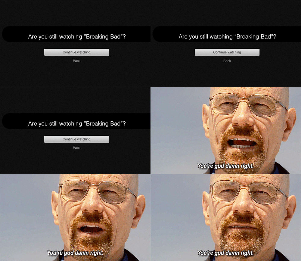
Loops and modes describe how the interaction behaves over time or in different contexts. Netflix asking “Are you still watching?” is a loop. Uber switching from a tracking map to a payment screen is a mode change.
Seen through this lens, microinteractions stop being “nice to have.” They become the smallest units of system communication, the minimal API surface between your product and the people using it. They guide attention, confirm actions, and reduce uncertainty. When they are missing or poorly executed, people click twice, abandon forms halfway, or assume the system is unreliable.
It’s important to connect this model to the developer’s mental model: Instead of saying, “We need animation here,” we can ask a better question: “Which state change does the user need to understand?” That question keeps motion tied to function.
Why animations fail
If microinteractions are so powerful, why not animate everything?
The first common failure is overuse. If every button is bouncing and the background is constantly shifting like you’re on a bad acid trip, users feel overwhelmed. Too many or overly complex animations frustrate people and drive them to leave. This is especially true for older demographics (looking at you boomers) who may not be as comfortable with highly dynamic screens and if your eCommerce store serves a broad audience, this matters enormously. A niche SaaS product for designers can get away with more visual play than a store selling household products to users across age groups and device types.
The second failure is distraction. If the animations become more noticeable than your content, they are working against you. The goal of a microinteraction is to enhance your content, not to overshadow it. If users are spending more time watching flashy effects than understanding the product, reading the message, or completing the action, the animation is taking up the wrong kind of space.
The third failure is heft. This is where the “Beasts of Burden” metaphor becomes concrete. Heavy or complex animations can significantly slow down your website’s loading speed, which leads to higher bounce rates and poor user retention. In eCommerce, your site should ideally load in under two seconds. If animations make this impossible they hurt your SEO ranking and directly reduce conversions.
The painful part is that the animation can look tiny on screen and still be technically heavy.
This was the issue with Martina’s GIF suggestion. GIFs are the default workaround. They work everywhere and require no player, but they come with a 256-color palette, large file sizes, and zero control once embedded. A five-second animation at a reasonable frame rate is essentially a stack of hundreds of bitmaps. For quick demos and throwaway loops that convenience is fine, but not ideal for responsive, state-aware interface design.
Our Neuralab hexagon animation was 236×208 pixels, 60 frames per second, and three seconds long going in a loop. Visually that sounds small, but as a GIF it could still become stupidly heavy for what it does. I tested it and exported the animations in various formats just to see the numbers.
Enter JSON
The answer was already sitting in our toolchain. We just had to stop thinking about animation as media and start thinking about it as data. Instead of exporting pixels, tools like Bodymovin and LottieFiles allow designers to export vector shapes, keyframes, and easing curves directly into a JSON (JavaScript Object Notation) file. Engineers at Airbnb recognized how useful this could be and built the family of runtimes now known as Lottie, which can read that JSON and render the animation natively on web, iOS, and Android.
The key idea is simple but powerful: animation does not have to be a sequence of pixel frames. It can be described as data that a renderer interprets at runtime. A JSON animation can stay sharp at different sizes because it is vector-based. It can be paused, played, looped, delayed, or triggered by user interaction. This makes it a good fit for loaders, icons, illustrated loops, empty states, logo motion, button feedback, and small interface moments.
Of course, this format isn’t perfect. Like everything in life, it has its drawbacks that should be considered before you put all your eggs in the JSON basket. If the animation depends on realistic texture, heavy shadows, blur, video-like movement, particles, or 3D rendering, a compressed WebM video file may be better. If the motion needs more advanced interaction logic, state machines, or input-driven behavior, Rive may be a better tool. Use CSS for simple state changes, hover effects, fades, transforms, and small transitions.
For the Neuralab website, JSON hit the right balance. We could preserve the motion design without forcing the page to carry unnecessary media weight.
The workflow we use at Neuralab
The journey begins in a vector tool. For very simple animations, we export directly from Figma. More complex illustrations often move through Illustrator and After Effects. The important part is to prepare the artwork with export in mind. Not every After Effects trick translates cleanly to Lottie. Position, scale, rotation, and opacity are safe. Shape layers usually behave well. Simple masks work. Heavy effects, expressions, and complex raster assets should be treated carefully. Avoid particle systems, lens flares, and complex glows, they either do not export at all or generate bloated, unreliable JSON.
Once the animation is ready, configure the export options, and click render inside the LottieFiles plugin for After Effects. It will scan the composition, capture every vector shape and keyframe, and write it to a .json file. Then we place the exported file in a publicly accessible directory. In a WordPress theme, that might be wp-content/themes/yourtheme/assets/animations/.
In WordPress, we can output a small container with the path to the animation:
<!-- wp:html -->
<div
 class="js-lottie"
 data-file="<?php echo esc_url(
   get_theme_file_uri('assets/animations/hexagon-hover.json')
 ); ?>"
></div>
<!-- /wp:html -->
That keeps PHP responsible for the asset path and lets JavaScript handle behavior.Next you should install the lottie-web player and wire up the interaction. The pattern below powered the hover microinteraction on the Neuralab website:
import lottie from 'lottie-web';

document.addEventListener('DOMContentLoaded', () => {
  document.querySelectorAll('.js-lottie').forEach(node => {
    const path = node.getAttribute('data-file');
    if (!path) return;

    const animation = lottie.loadAnimation({
      container: node,
      renderer: 'svg',
      loop: false,
      autoplay: false,
      path,
    });

    node.addEventListener('mouseenter', () => {
      animation.goToAndPlay(0, true);
    });

    node.addEventListener('mouseleave', () => {
      animation.goToAndStop(0, true);
    });
  });
});
The animation stays idle until the user hovers over the element. On the backend, assigning different JSON files to different pages is as simple as emitting different data-file values from WordPress. No additional JavaScript logic is required.
A few principles hold across all of these: avoid autoplay unless the loop has a clear purpose, lazy-load anything below the fold, and always test on a real mid-range device rather than a powerful laptop. The numbers rarely lie: compare the JSON file size against GIF, SVG, CSS, and video alternatives before you commit.
Unbeast the Burden
Martina’s animations made it into production. We did not drop her ideas. We rebuilt them as JSON animations, wired them into our architecture, and shipped them as part of a performance-conscious website. The result kept the feel of her original Figma prototype without wrecking load times or Core Web Vitals.
That is usually the right goal for website animation. Do not animate to fill empty space, but also do not strip motion out just because performance is a concern. Make the animation justify its place, then ship it in a format that does not make the rest of the website pay for it.
A good microinteraction should feel obvious once it is there. It should help the user understand what happened, what is happening, or what they can do next. When animation does that, it never becomes a beast of burden.

A Boletus aficionado who loves to get lost in the woods. He's still holding dearly to his OG Canon 5DmII while claiming that the play button is the apex call-to-action button on the web.