


Do you need quick & condensed information? Utilize dashboards!

Information overload is a common thing in the modern world. Data is all around us. Computers, mobile phones and all the other electronic devices are constantly feeding us with facts. If we’re bad at filtering and even blocking information, infobesity can be a real thing. One of the solutions is a digital assistant to help us filter and organize all of the data, and that is the dashboard.
To understand why a dashboard is an interesting user interface, we should go back to a graphical interface for a bit.
Why do we use graphical interfaces?
Before the beginning of graphical interfaces, textual interfaces ruled the world. They still have their advantages, but graphical interfaces turned out to be on a whole another level because of their simplicity and small learning curve. They made computers more accessible to everyone. Faster recognition of symbols, faster learning, faster problem solving, easier remembering… Those are just some of the advantages graphical interfaces have over textual ones. Of course, nothing is perfect so there are some disadvantages like more complex design and discrepancies in techniques and terminology, but those are acceptable. To summarize, humans respond well to visual stimulation, so a visual representation of data and nicely condensed information is something we all love.
Dashboard? Isn’t that used in a car…?
Yes, it is, and it is somewhat connected to our computer dashboard. Car dashboards have many buttons and dials that are easily visible like the ones for lights and air conditioning. They also display many useful information like current speed, temperature, errors etc. So, if we take that information, buttons and dials and put them on a computer (or mobile) screen, we get a dashboard this article is all about (here you can see some dashboard designs). We then have a screen full of digital buttons, dials, graphs and any other kind of information that can, for example, show us data from the stock market in a form of graphs, or even control our home! We’ll get to that. Now that we have an idea of what a dashboard is, it’s time for a definition. I like the one from Stephen Few, who published his in Intelligent Enterprise magazine. He said: “A Dashboard is a visual display of the most important information needed to achieve one or more objectives; consolidated and arranged on a single screen so the information can be monitored at a glance.” There are some key dashboard characteristics in this definition. Let’s talk about those.
What defines a dashboard?
There are different kinds of dashboards, but they are all based on the same principles. As a visual display, dashboards are usually a combination of text and graphics, but with an emphasis on graphics. Not because graphics are cute, but if handled expertly, graphical presentation can communicate with greater efficiency and deeper meaning than just a text. Our brains can easily extract the accurate and most important meanings from visual presentations, like symbols and graphs. Here are some of the dashboards key characteristics:
- Dashboards display the information needed to achieve specific goals. Accomplishing even a single goal often requires multiple sources to get all the needed information, and many times, that information is not even related. It can be whatever type of data. It can also be needed by anyone, be it executive, manager, you or me. In other words, if there is some goal to achieve you can benefit from a dashboard, and this fact alone shows their diversity.
- A dashboard fits on a single computer screen. The information must fit on a single screen. It must be available within the viewer’s eye span so it can be seen at once, at a glance. Scrolling around, shifting screens or any user input needed to view crucial information is outside of the core meaning of a dashboard. In that case it is either not a dashboard or there are multiple dashboards in play. The object is to always have the most important data effortlessly available so you can quickly absorb the needed information. Depending on dashboard type and purpose, various information can be displayed. For example information in real time, history of any kind of events etc.
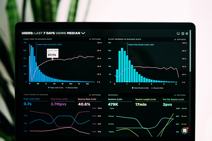
- Dashboards are used to monitor information at a glance. Although dashboards can display any kind of information, there is one thing they all have in common – information is abbreviated in the form of summaries or exceptions. Every single detail can’t be monitored at a glance. Dashboard must quickly point out that something deserves your attention and might require action. For example, in a regular car you don’t see oil pressure on your dashboard, but you can see a warning if something is wrong with oil in your car. To get all the detailed information you will need to go beyond the dashboard, which might include shifting to a different display or using some navigational method like drilling down. The dashboard fulfilled its goal if it tells you to act with no more than a glance. That is a goal for a new dashboard that Woocommerce built. To elevate the experience they introduced new reports which enable things like quickly filtering data and comparing data periods. This new dashboard shows a quick overview of store performance, and the key feature is it can be customized to user needs because every store is different.
We have now covered essence of a dashboard, but there are couple more interesting characteristics:
- Dashboards have small, concise, clear, and intuitive display mechanisms. If you want to fit an entire collection of information in a limited screen real estate, you must have display mechanisms that clearly state their message without taking up much space. Using something that looks like a fuel gauge, thermometer or traffic signal might be a good solution but if something else does a better job, that should be used. For example, digital gauges were used a lot in the beginning of computer dashboards, because they were just a representation of real world gauges. It was a time of skeuomorphic design, that is, interface elements were mimicking their real world counterparts. Today, when minimalism is ruling the world, they are not considered as the best type of displaying information, although there are signs of a comeback. Aside from the looks, the problem is they are showing only the current status, and not the history, so the differences between current status and the one in the past cannot be seen. Good example is power consumption, current consumption is pretty useful information, but also having a consumption from last month or year to compare is even better.
- Dashboards are customized. The information on a dashboard must be tailored to the requirements of a given person, group, or function. Otherwise, it won’t serve a purpose.
Dashboard is not a specific type of information or technology. It’s a type of display, a form of presentation. Having that in mind should help you in designing a purposeful dashboard, the one that will communicate the right information to its users.
The dashboard in a home
I’m a big fan of smart homes and building and improving one is a big hobby of mine, so I had to share this love with you. You’ve probably heard about smart home, or home automation. Different devices like switches, locks, sensors etc. are connected and integrated into one system that can do things automatically, or allow us to control everything with our phone, tablet, computer… The system can be set so that when it is sunset, shades are lowered, lights are turned on, doors are locked…all automatically. Getting new ideas for automating a home, and then getting all the pieces to work together in an imagined way can be a lot of fun! Because there are many different systems for smart homes (open source and commercial), the amount of work needed to get things up and running can vary greatly. But the ones that are a bit harder to set up often give a greater freedom.
System with many devices and options needs a UI that can support all that information, and you probably guessed it, it’s a dashboard! Dashboard for smart homes is a perfect combination of web application and interesting new technology. When it is web-based, it is available from anywhere. If you have the internet, you can control or monitor your home at a glance, even if you are miles away from home. One interesting automation in smart homes is connecting our dwelling with eCommerce. This allows smart appliances to interact with various eCommerce businesses and automatically order things for us. Smart fridges are a good example. Integrated cameras can see what is inside a fridge and recognize what is missing. So, if there is no milk in a fridge, it will be automatically ordered and delivered to your doorstep. Future! And also, it’s a boost of sales for eCommerce owners. And of course, this information can be visible on a dashboard so you always know what’s missing.
What about one at work?
If your job involves working on a computer, the first thing you probably do when you start your day is open all of the different pages in your web browser. Maybe a calendar, an email client, a page of your company, some web app for tasks, etc. And before you even start to work there are dozens of tabs open. This is a perfect scene to incorporate a dashboard! Company intranet with a dashboard as a pillar can save a lot of time for every employee. Every time an intranet page is open, the dashboard presents the most important information and actions to be made.
Neuralab made an intranet dashboard for CARNET (Croatian Academy and Research Network) which shows their most-used services, like calendar events, latest news and important links which they can see at a glance. To CARNET employees it means having faster access to the information needed at the moment. Also, it is a single place where every other service is available, at least as a link to that service page. The whole process of designing a dashboard for CARNET was based on the client’s needs. And that personalized experience is the crucial part to make it all work.
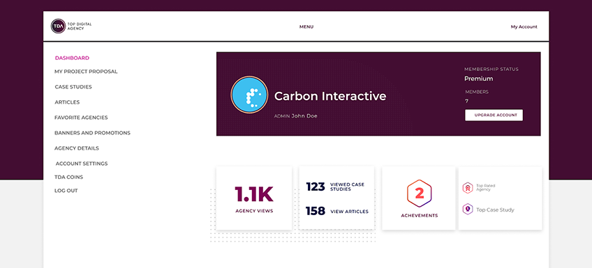
We’ve also worked on an enterprise-level project, TDA (Top Digital Agency), which is a platform for connecting digital agencies with clients. “My account” dashboard on this platform is a good example of displaying crucial information as soon as it’s open. Things like views and achievements are really helpful for agencies climbing the success ladders on a platform. And that is a goal for smart home, stock market, eCommerce or any other dashboard.
As we’ve seen dashboards are very versatile and customizable but designing one can be a long process. Saving time is always welcome so using some dashboard UI kits can be a good solution. Figma is our design tool of choice so you can find some UI kits for it here. And don’t let this UI shininess distract you, because the user experience is the other part of this coin which is responsible for making the users stay and come back again. So make sure your dashboard makes data more enjoyable and accessible for users and saves them some time in the process. And of course, tailoring it to users’ needs is the way of unleashing dashboards’ full potential.
Vedran Hanževački - visual author of the catalog you're (probably) looking at + UX UI Neuralab designer