


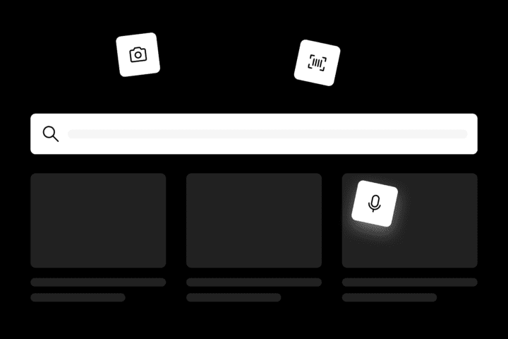
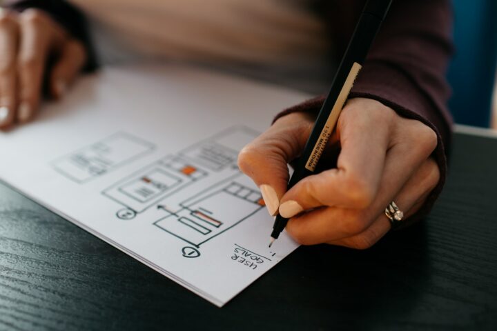
We’re sharing exclusive excerpts from our Design Handbook on creating intuitive, powerful web search experiences. Explore the full interactive handbook on Figma Community if you're curious for more!
Industry secrets. Sans the fluff
News
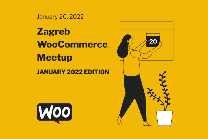
WooCommerce Zagreb meetup. A nightly recap for a puzzling agentic eCommerce world
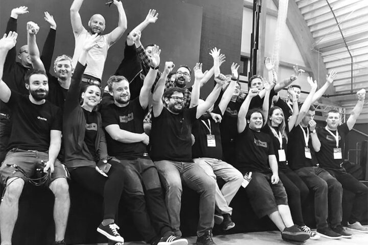
Neuralab hosted the winter 2026 edition of the Zagreb Woo Meetup at Holographik.Space, where around four dozen attendees came to hear directly from the Woo and Automattic teams and compare notes on how WooCommerce is evolving. This time it went beyond a simple local dev meetup!
You are reading: Design
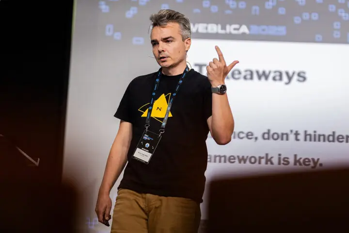
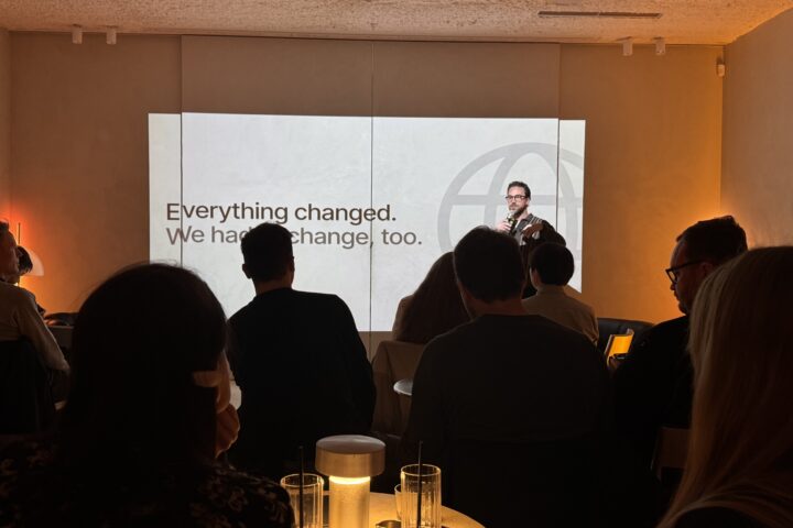
Last friday, I had the privilege of closing out Weblica 2025 as the final speaker of the day. For those unfamiliar, Weblica is a respected regional web technology conference held in Croatia's picturesque Međimurje region. As someone who typically works behind the scenes on conferences, doing video production and live streaming, stepping onto the stage at 6:30 PM to deliver my presentation was both exhilarating and nerve-wracking.
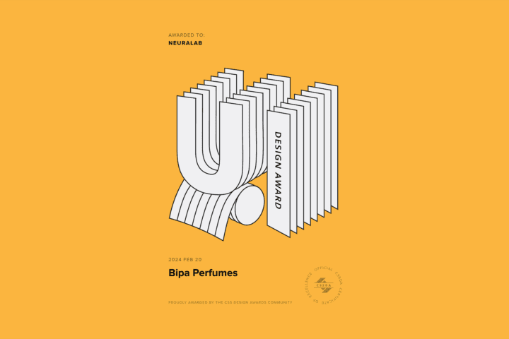
New award alert! The BIPA Perfumes website, an eCommerce catalog project led by Neuralab, has been honored with the CSS Design Awards for outstanding UI and UX design. This accolade highlights the innovative approach and dedication to excellence that went into developing this exceptional user experience.
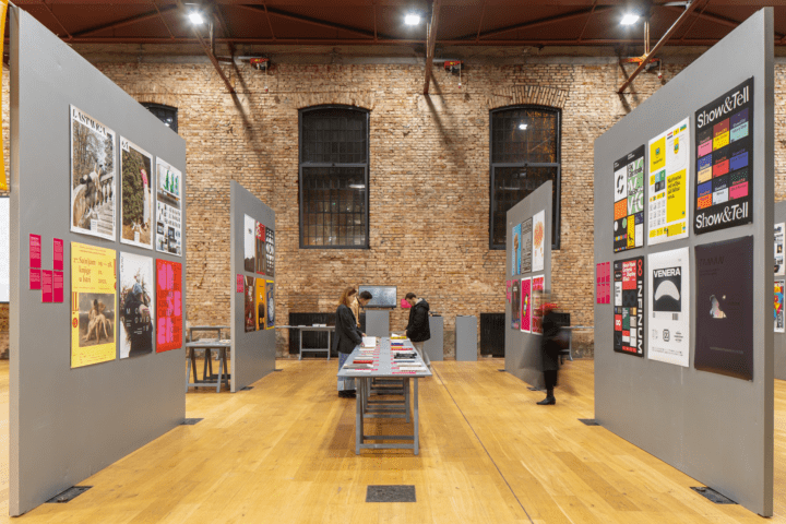
The biennial exhibition of Croatian design 21/22, which presents selected design achievements from the past two years in all areas of design activity, from visual communication design, through product design and packaging design, to fashion design, design in digital media and concepts, opened in Lauba - House for People and Art.
"Yesterday's amazing experience is today's okay experience" is the conclusion of the January edition of Zagreb WooCommerce Meetup. Iva Kosović and Martina Babić, our designers, talked about eCommerce's problems and UX potentials!

Information overload is a common thing in the modern world. Data is all around us. Computers, mobile phones and all the other electronic devices are constantly feeding us with facts. If we’re bad at filtering and even blocking information, infobesity can be a real thing. One of the solutions is a digital assistant to help us filter and organize all of the data, and that is the dashboard.

Designers and developers perform very different tasks when it comes to creating a product. What might seem completely normal and logical from the designer’s point of view might not necessarily mean the same from the developer’s side. This article will outline the key steps that make the handoff process from design to development smoother. It will also cover some common setbacks and their causes.
When it comes to e-Commerce, there are a number of UX practices that can undeniably be harmful to the business and should be avoided at all costs. Such as slow loading, confusing navigation, poor filtering and sorting options or lack thereof, missing or hard to find search, weak content, low-quality images, confusing check-out process or any of the dark patterns. However this article is not covering basic practices and fundamentals, rather focusing on some more specific patterns. It aims to find the good in those bad and the ugly patterns, acknowledge the primary idea but find a different solution.
Does this new buzzword deserve a place with other, widely known ones? Does it make any sense? Actually, what is it, who is it for? What it has to do with web design? We were at #CXZG conference in Zagreb where there was a lot of talking about customer experience and all of these questions.
Google Data Studio dashboards are powerful tools for presenting Google Analytics data in a visually pleasant and intuitive way. In this article, we will focus on how to use them in order to generate ideas and starting points for future UX improvements. Based on our own experience with this process, we will point out a few guidelines that showed the best results.

WordPress 5 is coming, you better watch out? The first upgrade of WordPress editor in a long time has divided the community, but what does it even bring us and do you even need it?
Istria, a perfect setting for any IT gathering. Windays, Weekend Media and Innovation Island have all recognized the energy that this wine & sun county can give to an event. Digital Lab.in travels in the same direction while hosting the entire conference in a picturesque (and polished) town of Labin.